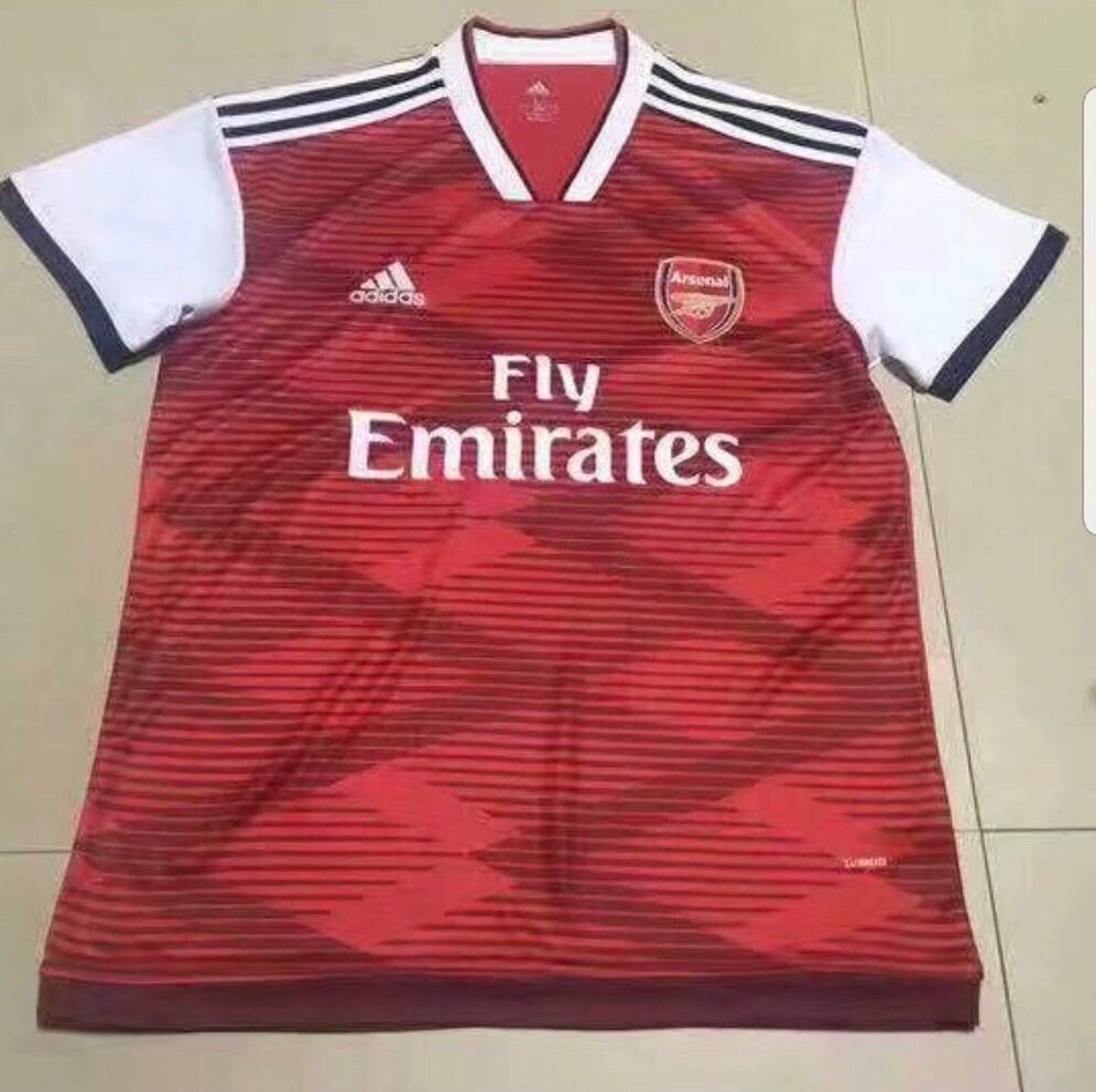
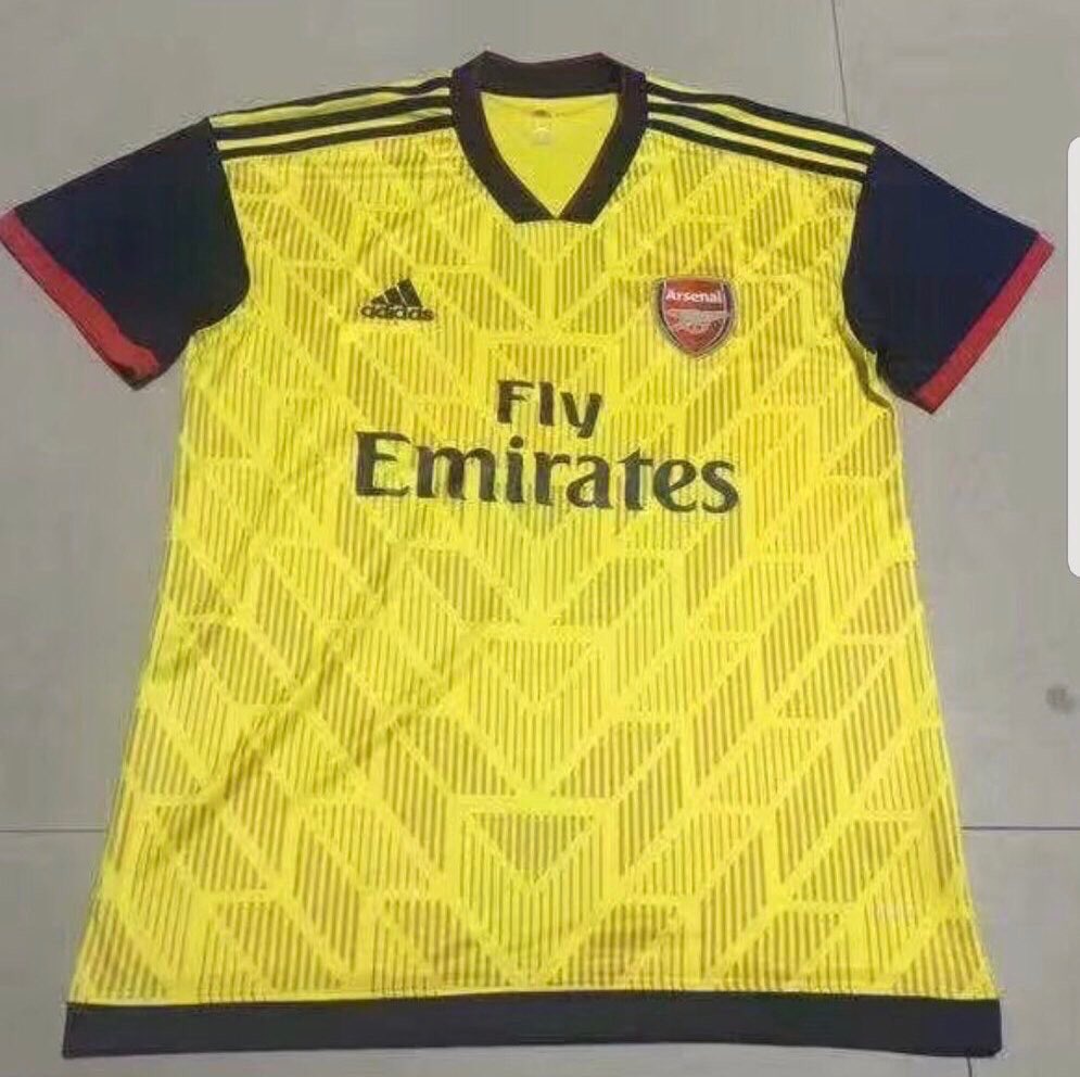
We can’t say with any certainty that these are going to be next season’s home and away kit designs, but they’re doing the rounds on the world wide web, and we’ve had quite a few emails sending them our way.
As everyone loves a good kit story, we thought we’d share them with you guys with the caveat that we can’t vouch for their authenticity.
They do look very Adidas, although perhaps a bit busy for our taste. No doubt you’ll tell us what you think in the comments below.
Home
 Away
Away

—
images via @afcstuff and various
Update:
Those have been debunked as a fan mock-up from October. See here.https://t.co/QQCEWLN6EQ
— GOOПΞɌΛDΛM (@gooneradam) January 7, 2019


Better than Puma
Why mess with the home kit though ?
Because the Puma home kits (all tbh) were generally rubbish…
not that rubbish! I don’t mind the away strip, but that home strip is turrible
Not crazy about the home kit, but away is an improvement over the last two years,
away kit is cool
Really? To me it looks like a late eighties/early nineties totally radical nightmare. Without all the patterns it would be alright.
That is why its cool!
i think they look great!
Away kit is very good.
very good fake away kit.
Really hope they are fake.
We’ve had Puma’s nonsense for long enough now, was really hoping for a clean classic home shirt with three stripes and a modernised, more understated bruised banana design for the away.
Very retro indeed.
I would love our shirts to have the Adidias trefoil though rather than the 3-band graphic equalizer….
Sadly Adidas don’t do that on their performance clothing, just leisurewear. The stripe needs to be all the way down the sleeve too!
Interesting. I guess there is only so much you can do with Red shirts with white sleeves, so this is something different. I like the away kit.
They look like something from the early 90’s.. Really hope this is fake.
Oh Gosh no.
Home kit is awful, too busy and too much blue. These don’t match any of the Adidas 19/20 teamwear templates, so I call fake.
My guess is this is a deliberate leak to gauge response. Would have no problem with wearing these, but I think there’s room to improve in sleeve & shoulder departments. Loving the patterns – very vintage.
Come to think of it, deliberate leaks to gauge responses do make sense. No wonder kits ‘happen to be’ leaked EVERY season!
Feels like https://m.youtube.com/watch?v=_mWF1LoNhKc
Come on Adidas…dont make me miss Nike now!
thank good they’re fake. the home kit looks horrible
Read the update at the bottom of the article. They aren’t from Adidas; they were made by a fan.
Not a fan, I’ve seen better concepts that are plain with the three stripes running down the sides and have crew necks
Retro look was fine for it’s time. What happened to just keeping it red and white? These kit guys really need to keep it simple.
These have been debunked as concept art. I don’t think adidas would allow the home kit to look this… “busy”. However, it’s within the realm of possibility that the 3rd kits and/or training kits feature more designs and graphics which is pretty common if you look at what they’ve been doing for club jerseys.
Training kits allow the manufacturer to go a bit crazy and experiment with designs that they can’t pull off with a home kit.
Hmm I potentially sort of like it, but it does go a bit beyond retro to be basically a pastiche
https://twitter.com/BetGoatUK/status/1049743956362358785
These are much better
Those are just identikits! Boring!
Those are actually wicked. Would probably buy all three.
Prefer the ones in the article above tbh…
Designed by Stevie Wonder on acid. Truly dreadful.
Not a fan. I think it could be that Adidas themselves leaked it as in to test public reaction, judging by the bold changes.
Why do leaked jersey images always seem to be taken with a potato haha
At least it’s yellow instead of medicine green!
That away shirt <3
Fucking yellow!!! Yes!!!
Put the stripe all the way down the sleeve though ffs!
Did a truck ran over the away jersey?
Has Hector been let loose on in the Adidas design studio?
He’s getting revenge for the club changing away from his sponsor Puma. We never should have let them near him in the first place…
Yes, please!
Love the new kits I think they look fantastic
I like the retro vibe. Sooo much better than Puma. And the Away’s Yellow!
As the update notes, these were definitely posted as concept designs from a fan last year. Probably not what our kits will look like for sure, Adidas will probably want to keep things simple for the first go.
Regarding the design itself, I personally like them. Away kit looks like a nice update on the bruised banana look and the 3rd kit looks amazing.
Clearly these are kids kits with the smaller badge being used.
Why would Adidas use kids garments when creating a prototype?
These prints shops in the Philippines need to up their game….
This is dangerously close to click bait, blogs.
That yellow kit has kevin Campbell written all over it
I like the home kit, not the away.
Not big lover of the yellow. Like something in the blackish range for away.
I won’t buy it. Retro in the worst way. Needs to be clean, sharp, and simple. Away needs to be yellow and blue.
To be honest I think they look terrible. Definitely wouldn’t buy either
That home kit is fucking hideous
The away kit looks like Colombia.
Anything other than blue is fine. Statistically we have lost more matches when wearing blue. (From what I recall, not actual stats but I guess I am right).
These would make me buy a kit for the first time in about 3 or 4 years. I see Charlie Nicholas when I look at the home kit, it has that modern 80’s look. 3rd kit looks good. I’d buy them both.
Kill me if you want, but I like what I see even less than the Pumas..
Wouldn’t be surprised if they are leaks to judge the general reaction
Not bad, looks like a slight nod to the chevron shirt
Is our away form in direct relation to the shittiness of the away kit?
They’re both bloody hideous! Keep it simple – don’t have to throw the kitchen sink at it.
I don’t actually believe it’s real.