We’re edging closer to a full reveal of Arsenal’s trio of new adidas kits for the 2021/22 campaign.
On Sunday, Footy Headlines shared a mocked-up version of the home kit based on their information.
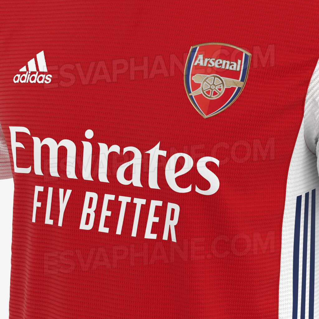
Since then, Turkish site Esvaphane.com has released a trio of photos that appear to show the actual home, away and third shirts.
Arsenal adidas home shirt 2021/22
Classic red and white with the adidas stripes positioned on the side of the shirt.
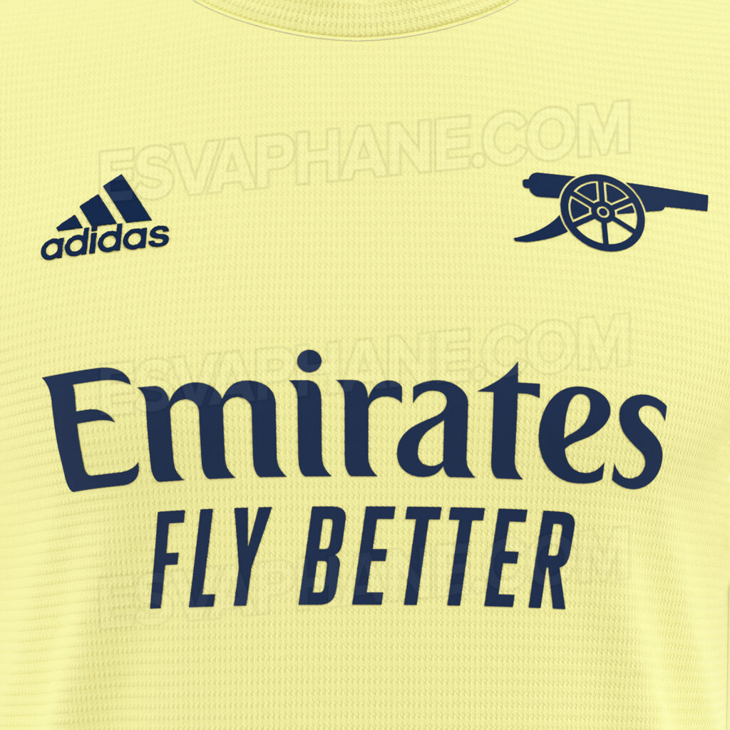
Arsenal adidas away shirt 2021/22
We’re getting serious 1971 vibes, especially with the simplified cannon motif instead of the usual badge. Apparently, it’ll have a ‘cycling’ collar.
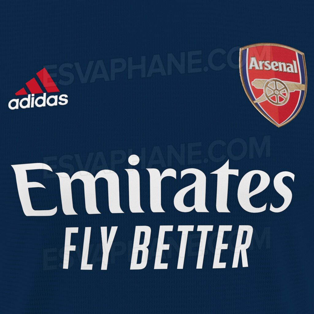
Arsenal adidas third shirt 2021/22
Again, a very simple design. With ‘Mystery Blue’ the main colour. Esvaphane also have shots of some associated training gear
__
This morning, Arsenal also confirmed the launch of a new capsule collection created by Hector’s mates 424.
It’s a range of black training and leisurewear which we assume the club will use in the coming weeks. Details of that can be found, here.





I like how red and white it is – reminds me of last season’s shirt
Red and white home shirt for 17 seasons running!
It can’t be a coincidence…
Actually you’re wrong. The shirt in 2005/2006 was not and that was 15 seasons before next season.
Make that 16 seasons.
Ah you’re right, I thought that redcurrant shirt was 04/05 for some reason
Simplified cannon? Halle-fuckin-lujah!!
Yes, yes, yes and more yes.
Yeah, I am really digging that away kit. Love the return to yellow, but it’s a ‘softer’ tone. I would jump all over that one.
I believe the simplified cannon is called art deco.
Not too shabby. Fits a team that will play in the Champions League!
Would love if they would put the – 71 cannon on the home shirt to.
I’m amazed anyone gets excited about next season’s shirts. If you had told me they were last season’s or from three season’s ago I’d probably have believed you.
Any reason why we should be excited (other than to give the club some cash for players)?
Because if they aren’t going to play up to expectations… they can at least remind us of the good teams by what they are wearing
Because its fun. It’s new shirts. An element of hope perhaps as well. If u don’t find it fun or worth your money etc that’s fine too.
Fully agree!
Adidas have done a good job so far
Much better than Puma
I mean, Adidas have been pretty much on point since day 1 haven’t they? I can imagine that away kit will be a top seller. Good stuff.
I love you keep the white sleeves
Does anybody else notice that the letters on the shirts appear to wobble as you scroll?
Nope? Just me losing my mind :p
It definitely feels like the FLY BETTER part slides left. Cool optical illusion 🙂
Simplified Cannons should be our fucking motto this year.
The current badge looks like it was made on paint and or word art.
If we can’t have the 1990s badge and form then I’m all for simplified cannons.
I’m feeling curmudgeonly today.
I agree. That cannon on the yellow away kit should be our standard badge from now on.
So it’s a new home away and third kit every season now? along with atleast 3 training shirts. Before we even think about prices it’s overkill for me. When I see an old shirt from.the 80s/90s I instantly remember a star player wearing it, great memories of wins and achievements in the shirt. These days I see a shirt a few season old and can’t even remember the year it was from.
Don’t buy them then?
You say that like it’s a new thing, we’ve had three new kits a season for seven seasons now.
Looks ok in general I think. Never taken to the latest iteration of the club badge so happy with the second strip. Would prefer it to be a deeper shade of yellow though. Can anyone enlighten me as to what a ‘cycling collar’ is, I have no idea…
Are these really legit?
I would be surprised, pleasantly surprised, if they actually had just the cannon without the crappy modern badge. What with the modern obsession with branding and having seen past efforts like this turn out to be fake I wouldn’t be shocked to find out that this was just fan art.
Not really liking that tone of yellow but would be nice to see the cannon on its own. Home effort looks nice.
Still not a fan of blue but I’m fine with it for the third kit. I’d love to see another green one one day.
Looking closely, these images are computer generated. Not actual shirts, but could potentially be the actual designs.