Arsenal and adidas have unveiled the new third kit for the 2024/25 campaign.
The shirt features a striking lilac-aqua blue gradient – reminiscent of the Northern Lights – with navy trim and navy branding. Navy is also the main colour for both the shorts and socks.
While the overall look is clean and modern, the use of the simplified cannon motif and adidas Trefoil logo adds a retro vibe. adidas have also used their iconic logo on new third kits for Real Madrid, Bayern Munich, Juventus and Manchester United.
Arsenal. An Original. Always.
The Arsenal x @adidasfootball Third Kit, available now 🛒
🤝 In collaboration with @placesplusfaces
— Arsenal (@Arsenal) August 12, 2024
It’s not the first time the Gunners have ventured into ‘aqua marine’ territory for a kit. Puma produced a toothpaste-like effort back in 2018/19 – granted it was more green than blue – and a couple of keeper shirts (09/10 & 10/11) ventured into similar territory.
The blurb from adidas reads:
The third shirt celebrates the evolution of originality; from the players to the club’s culture and broad community of supporters. A constant process of re-invention, the third shirt uses the past as a foundation to re-shape the future. Celebrating its uniqueness, we reflect on what it means to be a true Original.
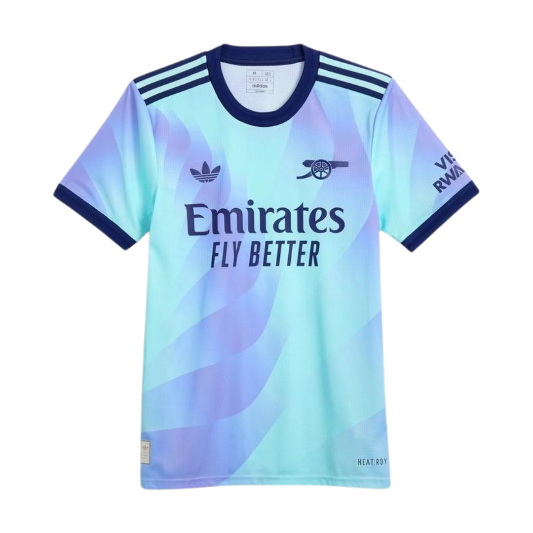
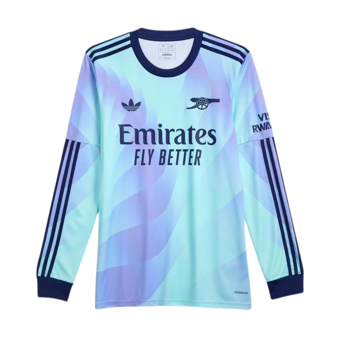
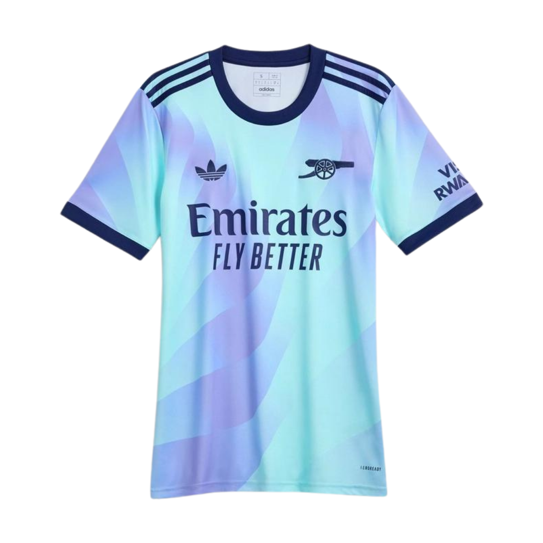
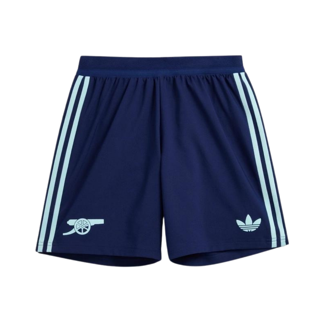
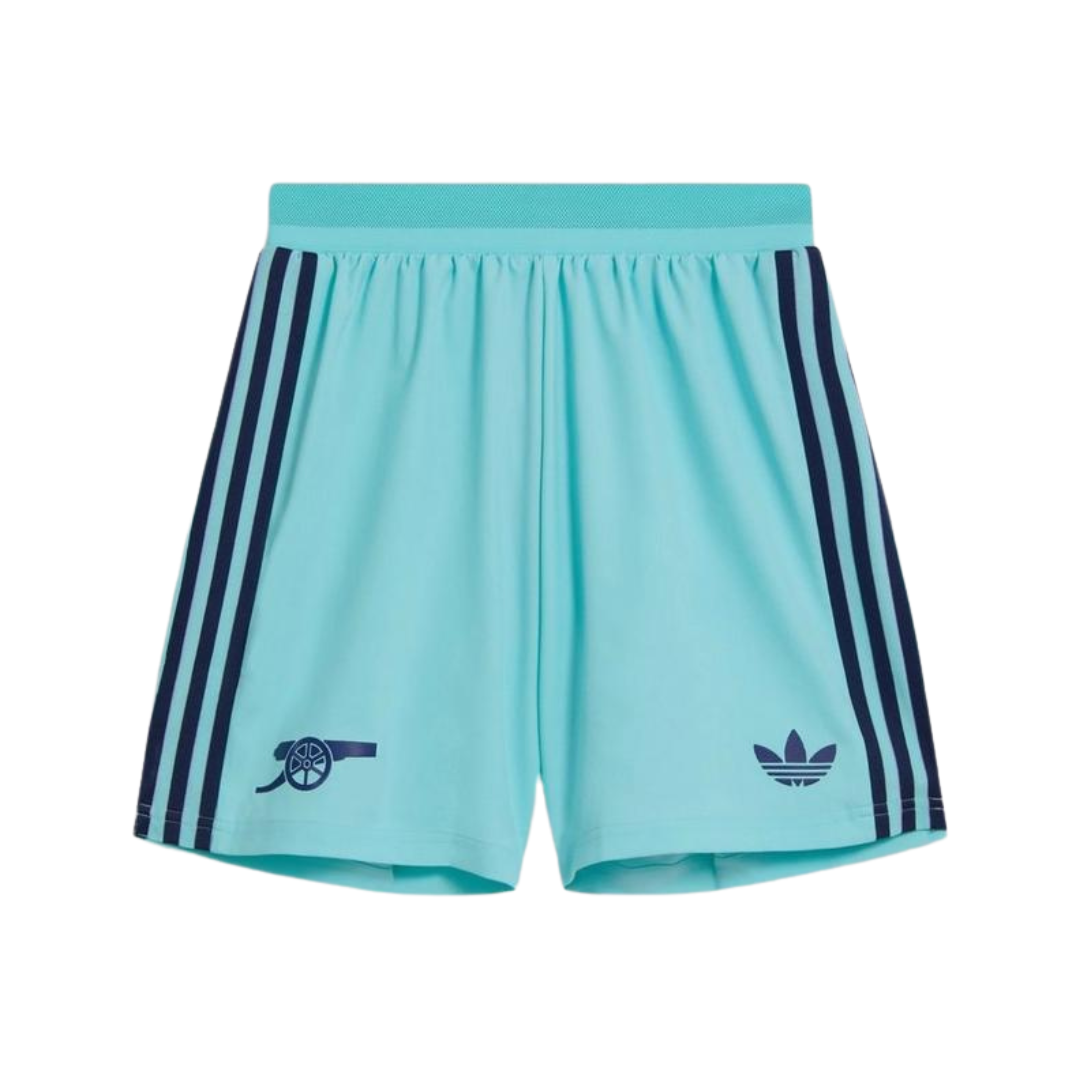
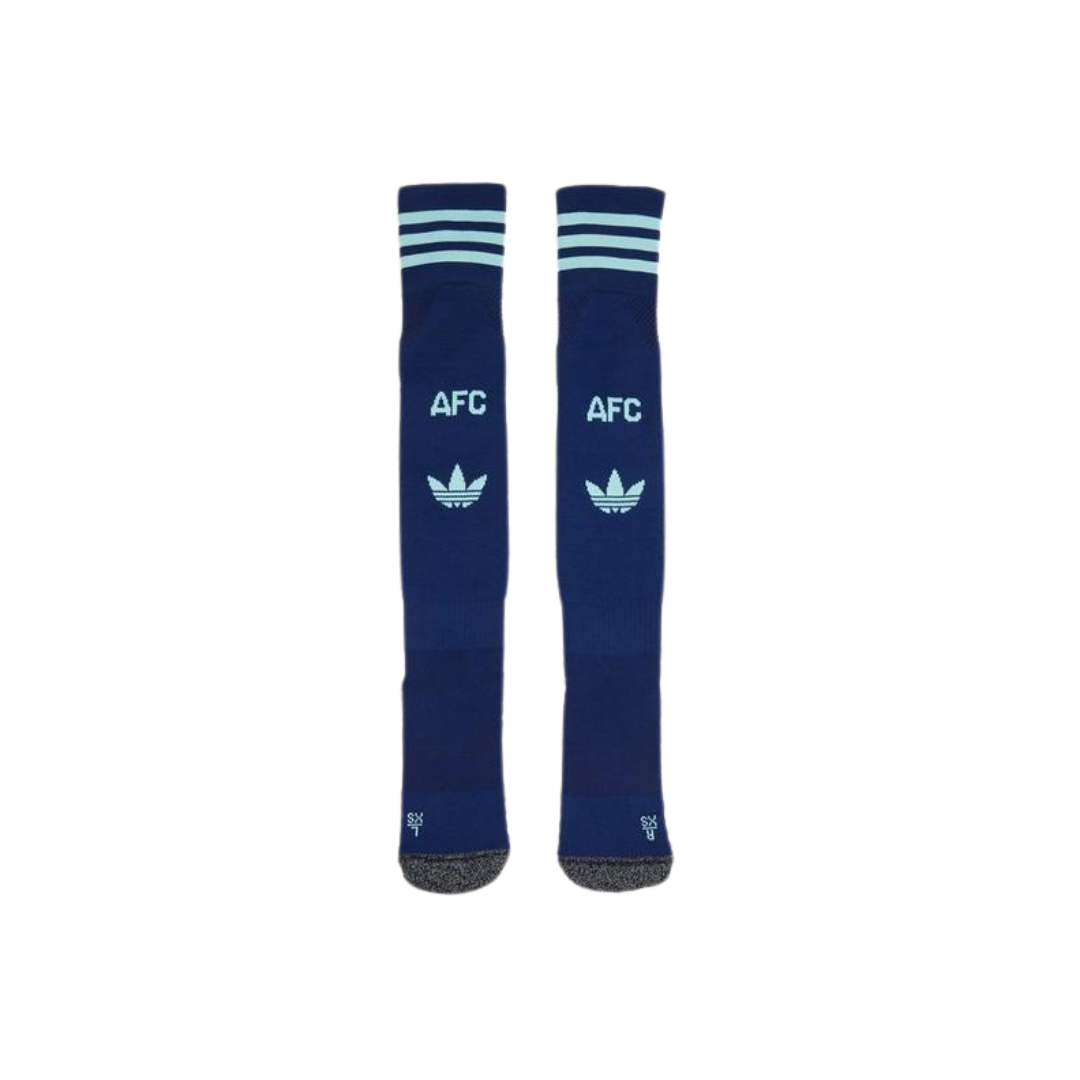
The third shirt is available as a replica (short-sleeve, £80 / long-sleeve £85) – and authentic (short-sleeve, £110) via Arsenal Direct.
A new black goalkeeper shirt, also featuring the adidas trefoil, has also been launched.
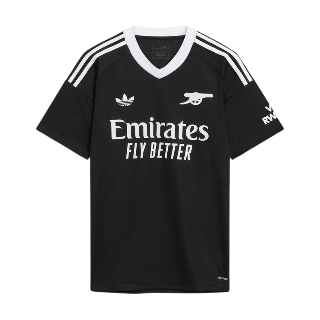


The “default screensaver” look.
Though this year’s kits haven’t impressed me much, they will be remembered fondly when we win some silverware!!
Went to The Armoury today to get the 3rd shirt and ended up getting the away shirt too, even though I always said (even upto today) that I don’t like it.
The things we do for the love of our club
Prefer this out of the 3 options this year. A shame it’ll hardly get used
My thoughts exactly. The best of the lot, imo. But we will only get to see it on European away nights.
That blurb from Adidas looks a lot like it’s really advertising copywriter’s wank-spik.
Maybe it’s just me.
Exactly what I thought. 300 words and said nothing at all.
Guess they can’t say “we thought it looked nice enough that you’d all pay us a lot of money for it”
Let AI generate our third kit from the next season onwards.
You can’t spell adidas without AI
The launch video is (again) absolutely great.
Just made my colleague at work (with zero affiliation to the fine game of football) watch it just because of The Bear reference.
Which part is The Bear reference?
Its focus on food, Will Poulter acting as a cook, the little ‘coming, chef’… it’s definitely inspired
I think it looks good. Love the retro look with tre-foil and canon, this is what makes it. Would like to see these on all our adidas kits. Simple and classy.
All I need now is a “Streetstyle” version of this and the home shirt (Away is awesome but not for me), so I can have one without the sponsor details…
My eyes! My eyes!
You know I kind of like it.
I love Arsenal so much, it’s nuts
It does look like my toothpaste. Goodness.
The black keeper shirt is great. Might look at picking that up. But then I like a simple look…
I’ve got the home shirt. Nice simple design, like the cannon. Away and third kit? You couldn’t pay me enough to wear that crap. Neither of them say ‘Arsenal’ to me. Sorry. No, not sorry.
I like this one a lot more than the away kit, whose colours clash so badly it makes my eyes bleed. Would love to see us win the Champions League in it.
I like it!!!!!!!