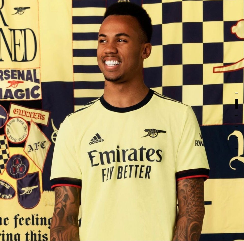
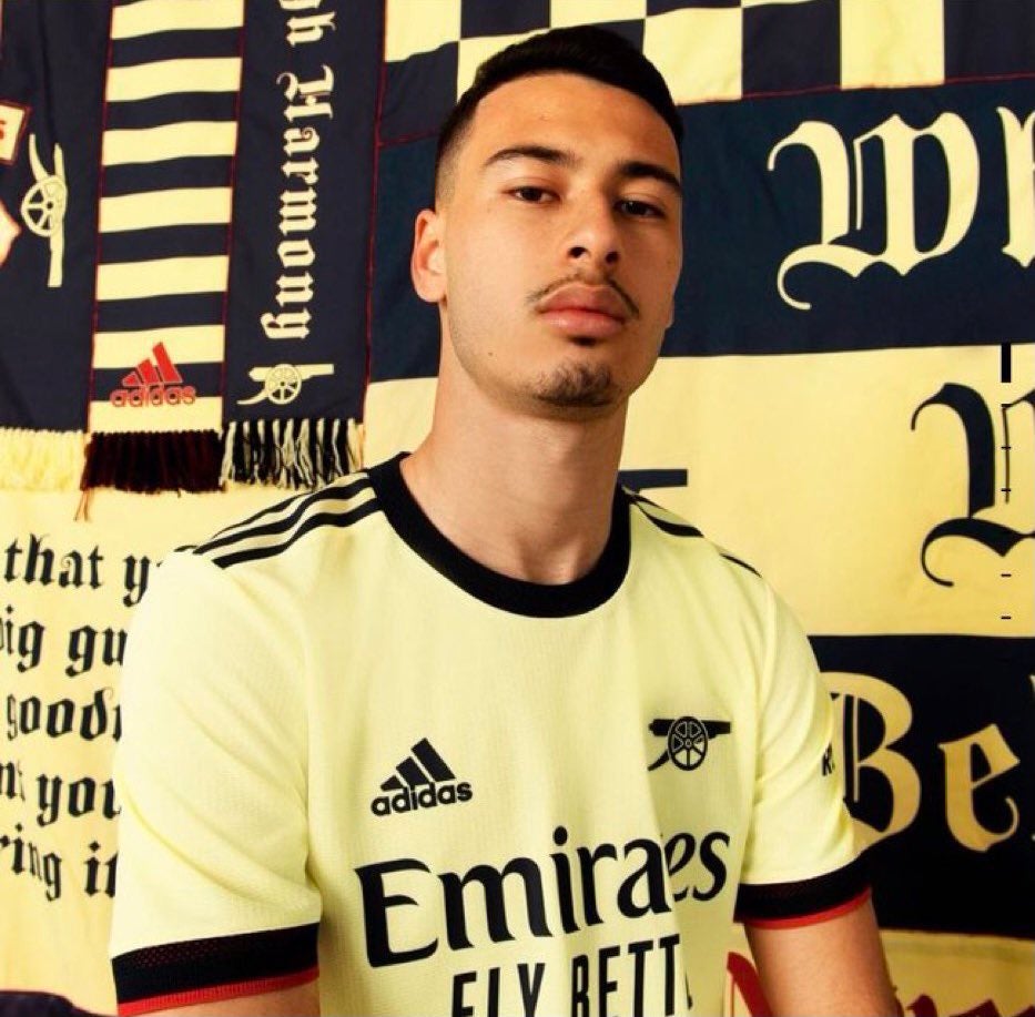
The first pictures of Arsenal’s first team squad sporting next season’s away kit have been leaked.
After this season’s, bloodshot eyes shirt, the club are returning to a more traditional yellow and blue combination for 2021/22.
The shade of yellow – ‘pearl citrine’ in adidas parlance – may look a little like custard but the use of the stripped-back cannon badge is a nice touch.
We expect to see similar shots of the home and third kits in due course. The latter is predicted to be blue with a lightning motif inspired by the kits of the mid-nineties.
What do you think?





I don’t hate it.
With these high viz shirts, even Willian can’t go missing in games.
Are you sure about that?
You beat me to it!
If only Willian could… ho, ho.
If we do use these shirts then the stewards should have to wear the pink and cream number.
If my work place is anything to go by, you can absolutely go missing in a hi-viz.
Our kits is the only highlights to our seasons now.
Worst part is knowing you’re not supposed to buy it as means to put pressure on the owners.
Phwoar look at the size of that cannon!
Like it.
Nice
Pretty good. I’d like the blue to be a bit more blue but I think it’s a play on a kit we had in the 80s.
Have to say, I do prefer it when we have a yellow away kit
“Here’s Arshavin, he’s played in, Arshavin, he’s done it! 4!! In the 90th minute.”
Who else was waiting for the first image to load?
😆
bloody dial-up….
really like it, much prefer that to the current one. well done Adidas
“leaked”…
people will probably find this somehow racist, whatever – while i can imagine this looking awesome on our darker skinned players (black men look great in yellow), i can’t see my white weakly bicepsed body looking good in this. callum wilson would look beautiful in this, and i’m not even gay (if we’d sign wilson, i’d reconsider)
it’s a nice kit
Whatever floates your boat.
Just come out already. You’ll feel much better.
You read my mind! It’s not racist at all. Everyone has a colour that suits them and if you have very pale white skin like I do it just makes me look ill. I’m pretty muscular but it’s not gonna help me much. Yellow just doesn’t suit me. Luckily we are so shit I wouldn’t even consider buying the jersey anyways but it helps they’ve made the decision easier.
What you said isn’t controversial in the slightest. You’ll find that throughout the history of clothing. Cultures have had traditional dress that contrasts with their general skin tone.
You’ll find that traditional clothing in India and Nigeria tends to be more brightly coloured. Whereas traditional clothing in Britain and Germany tends to use more neutral colours.
My mate Homer says he’s fine with it.
Does this mean we are signing Mbappe? Are we? ARE WE??
Yes. Kieran Mbappe.
I’d say Martinelli is white?! Looks good enough on him. Otherwise no offense taken I get your point, like a pinky salmon coloured shirt would suit darker skinned people more.
Can’t speak for all non-white (but still weakly biceped) supporters, but I look forward to yellow away kits for this reason.
Really like it compared to the current abomination!
If they had of done the leaf adidas with that cannon, wow!
I thought exactly the same thing! Great minds…
Me too lads. The adidas trefoil emblem is a classic.
It’s a shame the stripes don’t go all the way down the sleeves as well. Fucking sleeve sponsors – fuck that shit.
Also, not only are sleeve sponsorships yet another example of Kroenke greed/brand exploitation, they willingly promote supporting the dictatorship regime in Rwanda! Have these cnts no shame?
https://www.ft.com/content/678b2d31-cbe2-447a-8774-639087dfb863
It’s kinda ugly in some ways and kinda good in other ways. Pretty much sums up our season
The cannon is still facing the wrong direction.
But not for the last 20 years or so. There’s no club motto either (Victoria Concordia Crescit). Perhaps that should be re-instated?
There’s an immediate vote catcher with the fans for any prospective owner who wants to buy out the Kroenkes. Turn the canon around and reinstate the moto. Make the second kit permanently yellow and blue. Have the lads travelling to and from big games with the navy club blazer (gold canon) club tie and grey flannels. (We’re men, a football club, not a fucking boy band) Back in the day, these are the traditions that set us apart and caught the eye and have sadly fallen by the wayside. George Graham and Arsene Wenger always looked smart. Now we have… Read more »
Nice old school cannon. Very 1971. Nice of Arsenal to do this for my 50th birthday.
We once (and only once to the best of my knowledge) wore a massive and I fucking mean massive blue canon on the yellow away shirt in the centre of the chest rather than on the left side. It was worn when we played against Orient in the FA Cup Final Semi Final at Stanford Bridge in April 1978.
https://youtu.be/CRpmgS184Iw
Can any fellow old timer Gooners out there tell me if we ever wore it again that season? My memory is telling me that I don’t think we did.
Yes,away to Ipswich on the first day of the season in a flash flood and
possibly Utd(2-1 a Frank Stapleton winner) and Liverpool.I bought this jersey a few years ago from Toffs and I think its class!!
Thanks for this John – top post.
It was a fantastic shirt. Quite why that canon wasn’t kept was a disappointment to us all, I think. (Just imagine how that would have looked on the home shirt too)
I do remember that cup semifinal against Orient in ‘78. Two first half Orient own goals that Supermac claimed to be both his – I think he was credited with one. And then Rixy put us three up in the second half and that was that.
The less said about the final that year though, the better!
Cheers again. 👍🍺
* Semi Final
The way these shirts embody the history of the club is still such a beautiful thing to me. Every time we get the “leaked” images, Arseblog runs with it a wry but often historically rich analysis. I’ve been very impressed with Adidas and their ear for echoes of the past — I know that’s only where you’ll find our success, but to sew that in puts so much pride in the shirt, on and off the pitch.
Not bad
I really like it. It’s yellow and blue which pleases traditionalists/old gits like me and it’s classy. Reminds me an awful lot of the first ever Adidas away kit we had in 1986.
That was my first ever kit too. Loved it.
I wasn’t allowed an away shirt until 1989!
I really like it.
And I’m quite hard to please on such things.
Someone needs to check the contrast settings – yellow needs to be a bit more yellow, and the blue around 2 or 3 shades lighter. Looks decent though.
23:59: I won’t by Arsenal shirt because of the Kroenkes.
00:00: Do you have M size?
It looks great if you have a tan or darker skin but put this on my florescent white body and I’ll look like I’m undergoing chemotherapy. Yellow is just not my color. I’ll buy one for the gf as she looks great in yellow. It’ll serve well as a pyjama top or for odd jobs around the house like painting, cooking etc.
Expensive shirt for doing diy in!!
Absolutely friggin’ love the badge! Would love to see that on our red and white shirt. That’s the badge I fell in love with in the ’70s (the other way round, though, of course).
Nice. Just need some players to do it some justice!
Not bad. At least it’s yellow and blue – you have to be thankful for small mercies these days. Nice touch having the cannon on its own. Shame they didn’t do the same with the home kit mock up – perhaps they will now with the real thing. That would look good. One small criticism – that ‘blue’ needs to be tad lighter though – that’s almost black. The old skool yellow reminds me of the lemon Le Coq Sportif shirts that Tottenham wore circa ‘81 – ‘82. A nice kit actually and far too good for those cunts. Umbro… Read more »
You had me spitting tea with the sentence starting ‘A nice kit actually…’ 😂
Yeah. They wore it in the 1982 FA Cup Final against QPR. The cunts. (That’s Spurs, not QPR).
Looks like watford
Nah. This is a far smarter and more subtle colour than Watford’s garish crap.
Love the cannon…even if it is facing the wrong way. Would be cool if it became a regular feature on future kits and not just a one off.
But it’s not facing the wrong way. The club crest (since 2002) faces the same way and is replicated on shirts since then. True, versions of the crest prior to that were the other way around but something that’s been established for almost twenty years isn’t exactly a new departure.
Interesting to see that some soul has voted against a fact, rather than an opinion. Ho, hum.
Didn’t downvote you but the cannon is the wrong way round… but we’re being equally pedantic about that, more to the point is the old cannon was class and the cartoon cannon we’ve had for 20 years has surely been 20 years too long
Bloody hell has it really been 20 years?
Simple. Bring back the original canon. Facing West.
Why it was fucked around with in the first place 20 years ago is beyond me.
I’ve never really liked our current badge. Too Mickey Mouse Club. Which, paradoxically, probably makes it very appt at the moment…..
We have always won in the kits department. At least we win somewhere.
I’ll like to see the ladies version though. 😒
A really wonderful combination between tradition and modernity
That’s lovely
Looks OK to me, a yellow away kit always looks better in my opinion. However, if people stick by their comments elsewhere on this site, hardly anyone will be buying them because of the proposed, or much discussed at least, boycott. “Live” sightings of the shirts could well become quite a rarity, spotted only fleetingly on a relatively small number of football pitches across the country.
Alternatively one could find a very high quality fake on (for example) ebay for a fraction of the cost (£30-£40). You get the shirt KSE gets sweet FA. Win/Win
Well, it would certainly be “a” shirt, but if it’s a fake it can’t really be “the” shirt. But each to their own.
With you here Biggs. 👍🍺
I like it a lot
The cannon is pointing the wrong way and the shade of yellow is so blah…not a fan
Nice shirt. Could it be better? Yep. If I were the shirt czar:
1. Make the yellow a bit more yellow
2. Ditch the red accent on sleeves
3. Point the cannon west
4. Ditch the Visit Rwanda on sleeves (I know, but it still looks crap)
5. Use Salma Hayek and Penelope Cruz as shirt models
6. Sell a shedload of shirts
Anything that is yellow for away works for me. Blue just looks like casual wear for the high street.
Europa Conference winning shirt 😍
I really like it. Would buy for my kids, except I’m boycotting merchandise as don’t want to feed the greed of Billionaires. I’m already a hypocrite for not giving up my season ticket 😉
Despite your understandable stance on shirts, an effective (read: long-lasting), mass, boycott of tickets, along with merchandise is a very difficult thing indeed to accomplish. Not impossible, but very difficult and that’s why I suspect that you won’t be alone by any means regarding season tickets – but we’ll only know, one way or another, later on.
You see folks – the post above is the genuinely sad fall out from the diabolical actions of our so-called owner.
A father boycotting (and understandably so) buying merchandise for his family that at any other time he would have gladly done so.
Okester, if I were you, I’d write to the club and tell them what you’re doing and why you’re doing it. See if the fuckers bother writing back to you. Best of luck and well done for taking what must have been a difficult stand to take. 👍🍺
A nice kit to boycott.
Fuck Kroenkes.
No doubt that when it’s up for sale it will provide an (early) opportunity for potential boycotters to allow their actions to speak louder than their words.
Piss yellow
Is this to help auba rediscover his Dortmund form?
That’s not bad at all, much better than this year’s “Spurms jersey mopping an abbatoir floor” look.
i’m always happy when the away kit is yellow, pictures of ESR in home kit are leaked too
Hmmm… Loving the Cannon, just don’t like the fluorescent yellow. Now if it was the golden yellow of yesteryear then I’m afraid I would have to buy it. Luckily enough I won’t be, so stick that in your pipe Stan.😇
Pretty cool. Now start playing!
Quite old school. Return to the past..can we also go back to Highbury and the early wenger years while we are going all nostalgic
Very pleasantly surprised by the cannon. Super League bad, cannon good
I miss properly blue sleeves with the yellow. Very much a part of my childhood in the seventies.
The blue sleeves came along in 1988/89.
That said we had blue sleeves on the Bluebottle kit of 1982/83.
Finally some good news
Not to my taste at all but am sure that some will like it
Being Swedish and married to a Colombiana, I gotta say that this one will make my national team jersey collection confusing!