Arsenal have officially unveiled the new home strip for the 2024/25 season.
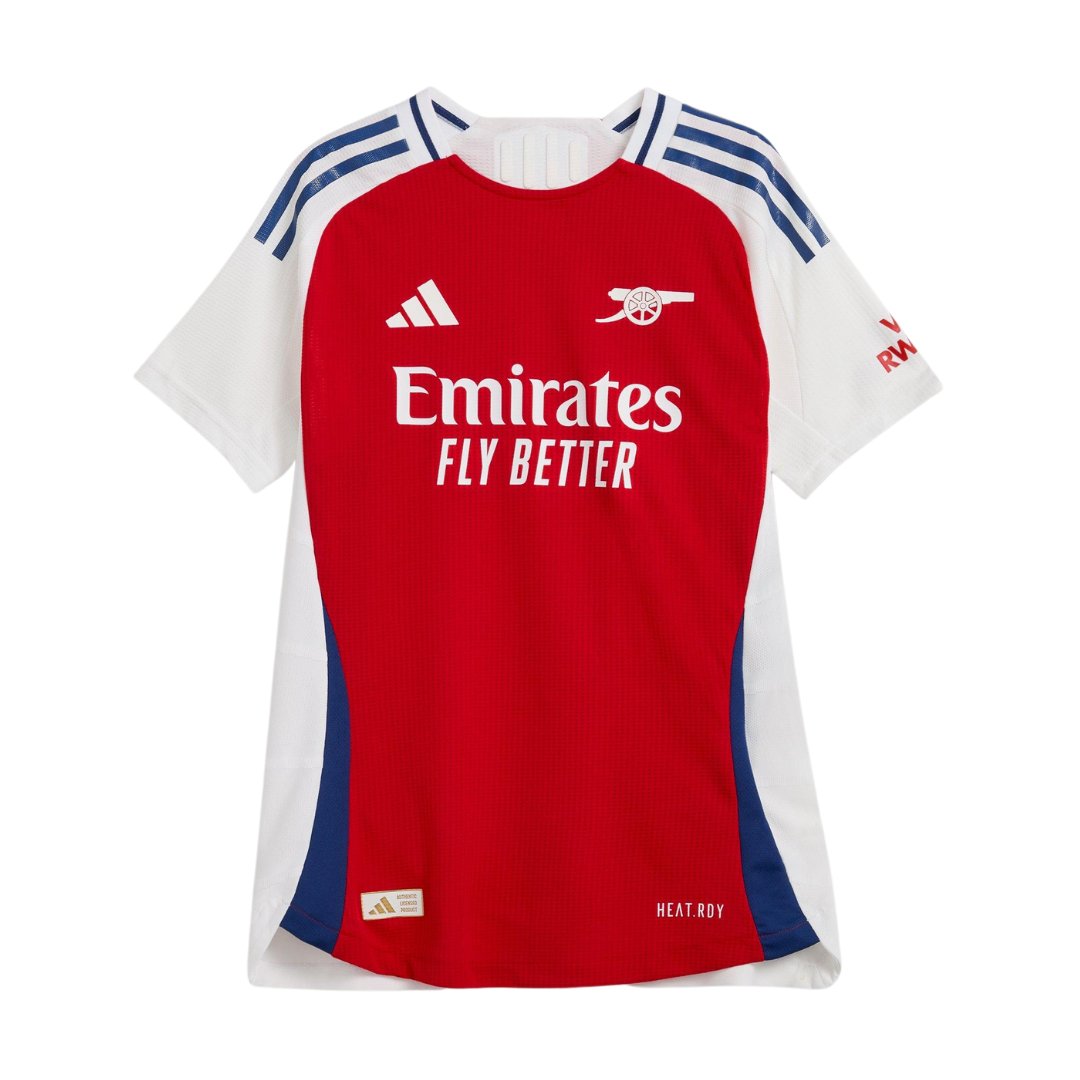
It is the sixth home kit designed by adidas since 2019 and the first to free the club’s cannon motif from the confines of the current crest.
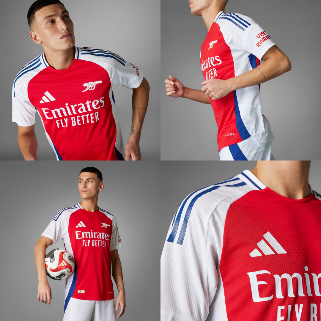
The cannon, like the branding of sponsors adidas and Emirates, is white, while Visit Rwanda on the left sleeve appears in red.
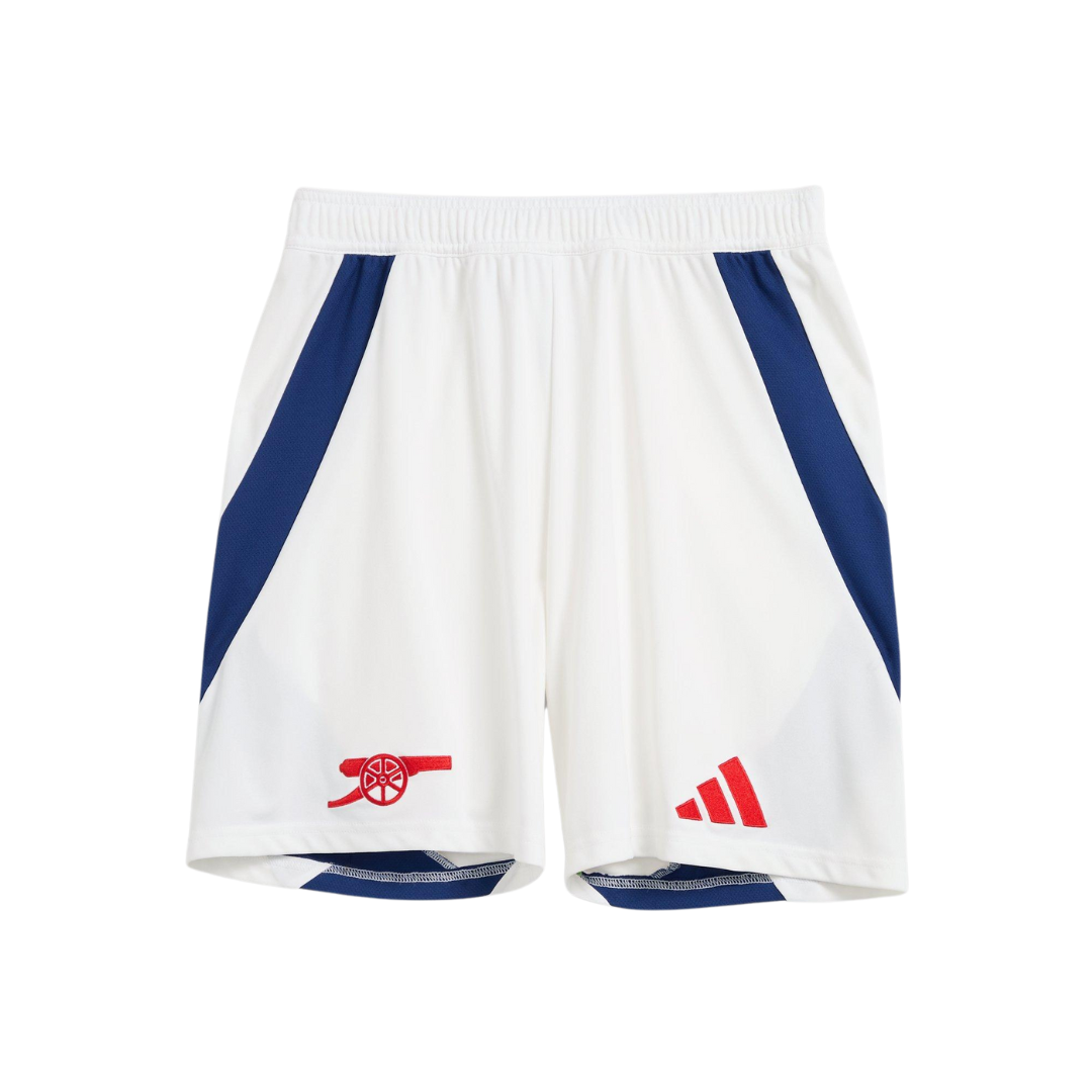
adidas have used blue as the main accent colour on their ‘Tiro 24′ template. It’s used for the brand’s trademark three stripes, the crew neck collar and borders the white side panelling to continue into the back of the shorts.
The overall look feels like a mashup of two previous kits; adidas’ 1990-1992 effort and Nike’s 1999 home shirt. The white is so prominent on the body of the design that comparisons with Ajax are inevitable.
The Year of the Cannon 🔴⚪️
Our new 24/25 Arsenal x @adidasFootball home kit is available now 👇
— Arsenal (@Arsenal) May 16, 2024
The blurb from adidas reads:
“A clean look for a young squad who have their sights set on the very top. Standing out over those timeless home colours, a simple heat-applied cannon crest is the star of this Arsenal authentic jersey from adidas. Stay-cool HEAT.RDY and soft doubleknit fabric combine to keep Gunners players pushing for more on the soccer pitch. This product is made with 100% recycled materials. By reusing materials that have already been created, we help to reduce waste and our reliance on finite resources and reduce the footprint of the products we make.”
As Mikel Arteta’s side are still in with a shout of winning the league, they won’t be wearing the new kit on Sunday. Instead, it will be debuted by Arsenal Women in their final game of the WSL season against Brighton on Saturday.
You can buy it now via the club and adidas for £80 or £110 for the player-issue ‘authentic’ version.






Not for me. The back is horrendous.
You won’t be saying that when we lift trophies in it.
If this years away can become iconic, anything can.
Especially when we finally lift that league trophy in 2025!
Red shirt with white sleeves. Wasn’t expecting that…
Looks like ill-fitting suit tails… why did they do that? Apart from the back it is pretty cool. But the back it ugly.
Is it just me or are adidas’ efforts getting worse as we get better ? Almost as if they don’t have to try so hard to get them to sell!
Yes. Adidas have been very underwhelming. I miss the Nike days…
Waaay too much white down the side. The front looks alright (although I feel that the blue accenting gives off a weird retro juxtaposition that doesn’t really work with an otherwise quite fresh kit). The back is bad, but may look better with names and numbers on. Not a great offering.
I personally love it. Not sure about the other 2 kits though…
Not brilliant, not terrible. The simple cannon should be used on all our kits from now on. Blue elements are nice, but the shirt should’ve been more red, less white. It won’t matter when we win the league in it though.
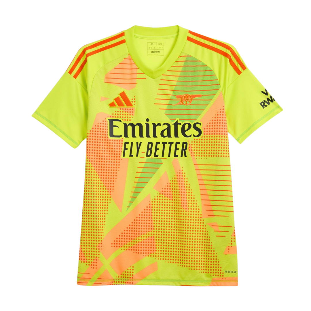
Not a fan. The keepers jersey looks like they took a road roller to Bikini Bottom. RIP Spongebob, Patrick and Squidward!
Designed to give opposing strikers a debilitating migraine?
Remember David Seaman wearing a technicolour yawn 🤮 for England – this is not that bad.
I really like it
Love it.
It’s not a terrible kit, the lack of anything uniquely ‘Arsenal’ is really disappointing though. It’s a just a genetic kit using Adidas’ template, remove the cannon and it could be a Fleetwood Town kit.
At least it’s better than the horrendous away kit. Can we tell Adidas to take a hike after next season please?
Those shorts are atrocious. Hope they don’t end up looking like our players were rolling around in the mud the whole day once the match is over. Gives me vibes of that other white kit we’ve used b4. Surely white should be eliminated as a dominating colour in the first brainstorming meeting, especially since it’s those lot’s colour.
That’s really ugly.
Not a huge fan. It’s like a white shirt with red on it.
Too much white and too much blue. Not enough red. Going to take some getting used to.
My Woking Kit looks better. Red core white sleeves. What are those awful white side panels & weird bum flap about?
Am I the only one that thinks that Puma did better job overall with our kits? Still, to be fair, this one is one of Adidas’ better designs. Will look much better with a PL Winners patch though 🙂
I think I like it as a kit, but I don’t think I like it as an Arsenal kit
The ‘Visit Rwanda’ part… quite a far cry from what we supporters rally behind. And yet, the loudest statement on the strip.
Why do we have to put that on the kit every season? Who in the club decided Rwanda should be a sponsor?!
Visit Rwanda in red… or in blood maybe
Just needs a simple “don’t” iron on transfer to be placed above it. Used to think the same when the slogan was “Fly Emirates”
Too much white. Hoping the away or third kit is better. Disappointed!
Like the kit, don’t like the price
£80!
It would have to be a darn-sight nicer than that to get me to spend that much on one.
Kieran Tierney will be pleased. The long sleeve looks like an old Tesco carrier bag.
As always, as long it says Emirates and Rwanda there is no way I wear that.
at last the tricolore represent.
According to the title, next season is the 24/24 one.
Does that mean it’ll be over by Christmas?
That’s an awful lot of games to cram in inside just a few months.
Maybe they are jamming in another winter World Cup and not telling anyone til last minute…
Time to talk to Nike again I think!
Disgusting.
Usual dislike at first sight before I start to get used to it during the season, before I dislike the next one (…at first sight, before I get used to it during the season [Ctrl C, Ctrl V] etc.)
Another Ajax shirt? Jfc Adidas find a new template… everyone is playing in the default evo kit
Take away the blue stripes, Adidas, Rwanda & Emirates logos and you have quite a good shirt.
Too much blue!
I’ve always been more invested in who’s inside the shirts tbh but as Arsenal shirts go there’s a limit to what is new and what any designed can do with the home shirt. But here’s a novel idea let’s go back to how it used to be by making every new shirt last two seasons.
Awful, not enough red on shirt and what’s the connection we have with so much blue on shirt, why not red adidas stripes also ? and how much longer are we contracted to promoting a VISIT RAWANDA on our shirts, personally it’s not on my list of a holiday and I would be surprised how many arsenal supporters have actually went there because it’s on our shirt, arsenal fans were not happy with Puma coz they weren’t Nike, Adidas but looking back their shirts were a lot better than Adidas..
Yup – how can the club continue to support Rwanda given all its horrific history?? Enough is enough. Adidas Arsenal kits look like wales/Wrexham etc. they’ve never done the sleeves right. Generic training kit with a badge slapped on. Bring back Nike or Puma!
It has something of a National Team feel about it. If it wasn’t for the cannon, you’d say Odegaard is away with Norway on that picture.
I couldn’t care less.
Was just showing my wife the kit for next season (seeding for xmas) and she goes, ‘ah yeah, retro. The shoulders look like the old Tescos shopping bag!”
Ruined it for me.
Meh. The only thing i took from the video is that dance music sucks just as much as when i DJed 30 years ago.
Getting closer to Ajax shirt
Will look great in my Tesco bag