

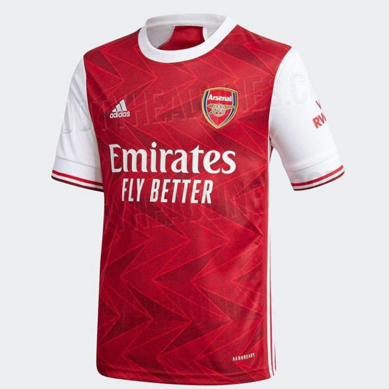
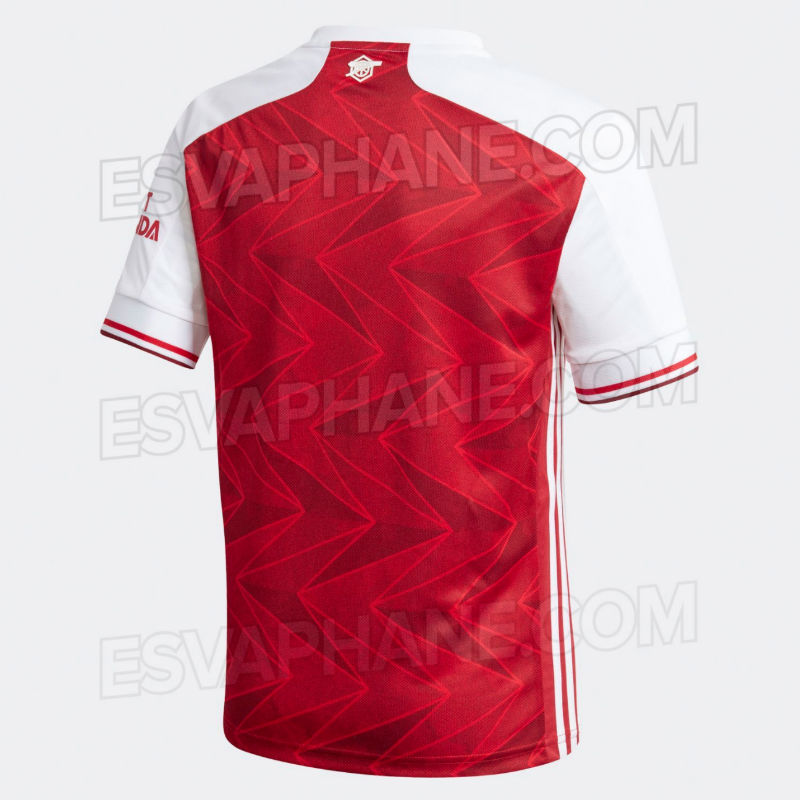
The first pictures of Arsenal’s adidas-made home shirt for the 2020/21 season have been leaked by Footy Headlines.
Here are the main details:
- Red and white (phew)
- Simple white crew neck collar
- Red and maroon piping on the sleeve cuff
- Adidas three stripes down the side of the body
- Updated Emirates ‘Fly Better’ logo
- Horizontal chevron pattern gives the red body a two-tone effect
- Cannon motif housed in a snazzy art deco hexagon features on the back of the collar
It doesn’t quite have the retro ‘wow’ factor of the current shirt, but it looks very tidy indeed.
Our away kit for next season, whenever that is, is due to be ‘cloud white’ and maroon while the third shirt is apparently blue and orange. Lots of training gear has already been leaked, more details here.
Thoughts on the home kit?


Naff
Excellent. Can’t argue with it. Not the most classic kit ever, but certainly a nice shake up. Thank goodness we’re not with Puma.
I like it, got a touch of retro about it. good job
Not great, not terrible
Came here to say this
3.6 roentgen?
‘FLY BETTER’ looks terrible. And, as much as I’m
up for fetishizing the retro look, the
chevron motif misses the mark in my opinion.
The “Fly Better” is terrible. We shouldn’t be using slogans along with logos.
Fly Nowhere???
Yeah the patterning ruins the kit, looks more like a training kit than a match jersey. it’d look clean and crisp kit like the 10/11 kit.
It’d look better with saka and auba signing deals wearing it
Better than the Puma kits, but nowhere close to the style of this season’s kit.
Pretty simple kit, I like it. Reminds me of the 10/11 kit and Tomas Rosicky.
After looking at it again I’m seeing Chamakh, which isn’t so good
I like… last year’s bruised banana redux, the retro centenary shirt and this and I’m sorted for a while.
Now we just need… a new season!
Finally a nice white collar! This is very nice overall, great combination of retro and modern. Very Arsenal, very adidas. Fly Better can f***off
There are technically 6 six separate fonts on that shirt. That’s far too many and makes it visually jarring in my opinion. The prime culprit being Fly Better.
Agreed, completely
“Fly better” is on a different plane, for one thing
Bad choice, worse slogan
Won’t it be cool if they made these kits without the addidas, Emirates and visit Rwanda logos. Just the Arsenal logo. I will buy one every season.
Yep. That way we wouldn’t be able to afford even the groundskeepers.
What do you mean “next season”? And thay “fly” sounds like sciencenfiction now.
Be nice with the tree stripes on the shoulders, nice kit though
I know that we as a club cannot be overly picky when it comes to finances, given our self sustaining model ( a k a the Kroenke Trust), but the decision to sell an airline through our shirts and stadium feels so off in this day and age…
The Fly better, could get same font as Emirates and then a much small font size, its causing alot of disharmony on that front
Blue and…. orange?
A tiny piece of me just died.
Yeah, I must admit that I lack the fantasy to imagine how that could look good in any way or form, so I am intrigued to see it.
Nice. Nothing overly creative.
But what’s up with our cannon on the back of the neck? A simple cannon would suffice or that old “A” arsenal logo thing. Not both together…
I actually wouldn’t mind it if the cannon were a little smaller or the hexagon a little larger. The way it is now, they both look crammed together and not as cool.
My initial thought was ‘what the hell is that?!’ It might grow on me, but certainly nowhere near as nice as this season’s kits
Looking amazing I love that ….
Its not terrible. I mean, have we seen Man U leaked kits? Haha
I hope they’re paying us extra for slapping a slogan on as well as their logo
Not so bad otherwise
I agree, that just looks crappy. I normally don’t mind sponsors and whenever I read Sega or Dreamcast on my old shirts, I remember that console fondly. Also that I chose a JVC TV for my granny, because they were the Arsenal sponsors. But this font combination … good lord, I think I am going blind. Otherwise the shirt is really nice.
Anyway, really funny that we are promoting two things that are hardly possible at the moment, flying Emirates and visiting Rwanda.
I feel like someone made a nice kit, then when it was presented to the ‘boss’ the reaction was “it needs something to make it pop!” and so they added that montrosity of a ‘chevron pattern’.
Let’s hope it will bring winning blessings in our team
Not that good but ts alright..
Looks like airport carpet. Shite
It looks outdated already.
I like pretty much everything about it, except the size and font of the slogan – too big and too 80s.
Looks a bit embarrasing, like a training kit. I liked Puma much more.
But hey, it could be Auba’s style!
Messi would look good in that
It’s OK. basically this years, but with a round collar and weird chevrons.
I’m intruiged by the away kit, sounds like it could look very very retro, positively antique, maybe they saw the English game on Netflix.
I assume the GK kit will end up being generic like this season. I saw that neon green one on so many other keepers.
Shame adidas can’t do a well fitted womens shirt.
Cool, they went with red this time!
Is someone at Adidas having a laugh? This is almost worse than this season’s home kit and that’s saying something. Sorry Adidas, but the kit designs are far from innovative and are just plain boring. In my opinion, bring back Puma over this any day.
Ah not a bad shirt, think I might…FLY BETTER? *Puts £80 back in wallet*