

The first images of Arsenal’s away kit for the 24/25 season have been leaked by Footy Headlines and first impressions are not great.
We’ve known for some time that the kit would be black with red and green accent colours but the end design, featuring trippy/marbled sweat marks under the arms, leaves much to be desired.
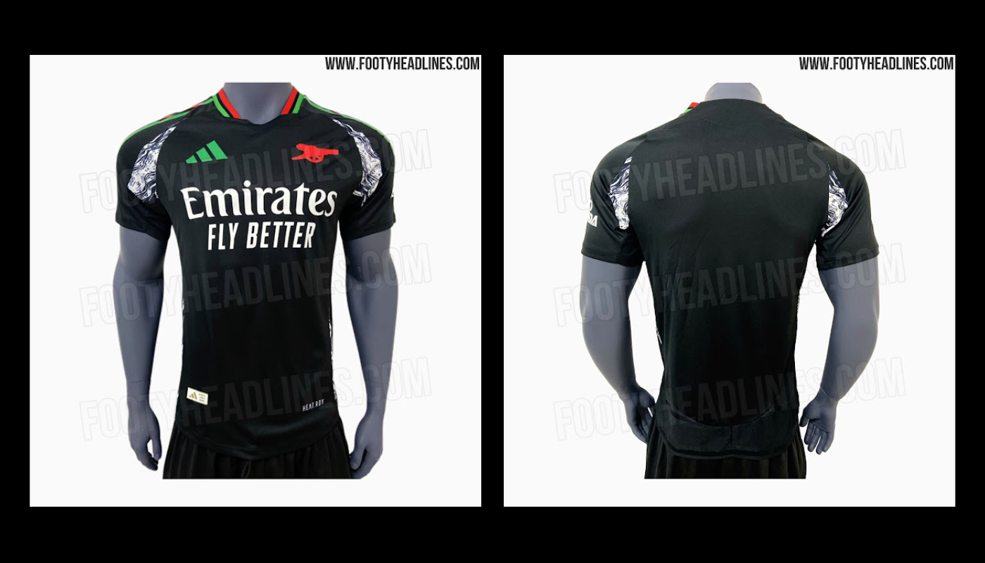
We could write a few more paragraphs but a picture is worth a thousand words. In this case, 999 of them are “NO”.
Without doubt, adidas will come up with a back-story to explain it, something to look forward to when the kit is released later in the summer.
Given the home kit is pretty underwhelming, we’ll have to hope our German kitmaker has something decent up their sleeve for the third.


Terrible, nothing to do with Arsenal. Black, green and grey belong on the goalkeeper’s kit, not the outfield players’.
Why don’t they just resell last seasons black kit. I’d happily buy that again.
Is the green symbolic of the green pitch that we play on???
Answers on a postcard please to …..
I think we could stop the production of this monstrosity.
Everybody retweet the shirt with the following: #FreePalestine
I…like it (or at least it’s better than the yellow one this season).
As a kit, it is ok at best.
As an Arsenal kit… I just don’t get what is Arsenal about it beyond the canon.
I’m thinking, perhaps, the kit, like this season’s, makes us look a bit tougher on the road. I mean, the dark look suits our dark arts master: Ben (the irony of it) White.
The red and green accents are a nod to the way that Christmas came early in 2024, what with the title win in May. In turn, the armpit stains signal the fans’ experience of that title journey, which so often included intense sweating, like, say, what I experienced in the final moments of Sunday’s derby. It all makes sense. Thank you, adidas!
I like to think that this season’s “radioactive Zebra” kit will be looked back with fondness like the bruised banana.
That’s setting the bar pretty low! It’s a truly awful shirt.
I counter any no with a giant YES!
The kits get better and better for muscly, Adonis-like athletes and worse and worse for my body shape – rotund with a side of meatballs.
Commercially it makes no sense to make a kit that suits 25 people, and makes 100,000 morbidly obese fans look like the Michelin man.
Its not flattering us skinny guys either tbh lol at allll
Most of the 100,000 think they one of the 25. They check the fake mirror at their gym then straight into sports direct.
Not crazy about either jersey so far.
I actually quite like the home one – this thing is an abomination.
Not helped by the gorilla modelling it.
Kits always look much better when backed up with victories.
I’m loving our neon green shirt. Excellent memories…
Yellow and blue for me.
That’s our second kit colours through my lifetime.
Bang on!
I can accept green also, but definitely no black, charcoal, salmon or redcurrant, and absolutely categorically not blue, ever!
What happened to Gold/Yellow w/blue shorts? It was our core away strip and we won 3 FA cups wearing it — bring it back, albeit in whatever poncey-design fashion Adidas contrive
Maybe I’m seeing something that isn’t there, but with the world the way that it is I’ve been conditioned to think this way, so don’t blame me:
Black, white, red, green – the Palestine flag colours. Do you think that adidas are hoping that some viral controversy spins out surrounding this kit for the free marketing and to take advantage of widespread pro-Palestine sentiment right now? If so it could get ugly especially with our local rival’s Jewish connection
I hope not
I don’t think it’s that. I think it’s probably to do with Emirates and the UAE. This is our equivalent to Newcastle’s green away shirt.
I think given the sensitivity of the current conflict it’s also a crass choice.
It has to be said it is Mexico colors as well. My wife (from Mx) is stoked on it for that reason. Saying it is “tone deaf’ to the conflict going on is a bit ridiculous. Also it could be Africa as someone mentions..
It could relate to quite a few different countries and regions to be fair. But adidas with their huge design and market research budget would 100% know that a large proportion of people would associate those colours with the Palestinian cause at this point in time. Creating controversies seems to be a common marketing strategy lately I’m not saying it should be controversial, just that I wouldn’t be surprised if it is made into one. I just really don’t want Arsenal to become a political battleground for this and become associated with some inevitable ugly and/or insane opinions which would… Read more »
Highly unlikely given how the club aaked Elnenny to reel in his social media support for Palestine, it made our sponsors Lavazza feel uncomfortable.
Seems like we are countering the high visibility away kit of this season with black away kit. Dont like it at all. Our current away kit looked ugly but with so many outstanding wins with that jersey, I have started liking it. Hope that will be the case next season too!
A big YES. Definitely a move away from tradition. But I think the home kit has that part covered. I think it is good that kit manufacturers do try new things and do attempt to create new traditions and reach new audiences. I say this partly because Arsenal have had sooooo many great traditional kits….and I think we will always have the solid and more traditional options. The wrighty/rocastle story is a beautiful background to this one… And maybe worth saying that the black/green/red colourway will possibly go down as the most African premier league kit ever? Pan African colours…… Read more »
It’s homage to Kai… Waka Waka
Hommage to Basque country perhaps? But it is quite horrendous.
I see this kit, I think of AFCON
Did we sign Chris Bumstead?
Still better than all those years with that silly cat jumping across the kit. Maybe be swayed because our team was struggling, but genuinely cringe even watching highlights of those years. Mexican Gooners will be excited for this, no doubt
We play better when we have a high visibility away kit. Bright yellow for 2004 invincibles, 2002 gold sega kit (a little dull but not dark), 1998 yellow JVC, 1991 yellow JVC banana peel, 1989 yellow JVC, 2024 neon green weird thing.
I think it’s harder to see your teammates when wearing dark colours.
It’s less scientific. We never win the league unless we have a yellow away kit. It’s a jinx.
We were the best away team last year in all blacks…
The very reason Herbet Chapman gave us white sleeves! So you can see your team mates.
Legend has it Real Madrid had the same reason for all white (no hi viz back then)
Holy Shit, what the fuck is that?? Remember when Adidas started by giving us great, traditional-looking Arsenal kits… Good times!
Man u changed their kits at half time in a game vs Southampton in the 90s,because the players said they couldn’t pick each other out against the colour of the crowd.
Almost 100 years ago Herbert Chapman gave the Arsenal white sleeves so that the players could see each other better (early use of marginal gains). I can’t see how these black kits will do us any favours on the pitch. I’m really surprised that Arteta would sanction us playing in these shirts, considering how he likes to micro manage every concevable advantage.
It looks more like a training top than a game jersey. That may be part of the plan to sell more to people to use for everyday exercise, but it lacks the gravitas you want in a game jersey
I guess the black works well as a fashion item, but it looks a little cluttered with so many logos.
I’d always go for yellow away for the team though.
Not for me,
I prefer the yellow away shirt 👍
They should have stuck with converting the Wrighty kit into a matchday
That would be siiiick!
It must be a GK kit, that bit of tinsel under the arms designed to reflect sunlight into a stickers eyes.
Free Palestine edition. I like it!
Why the down votes? It looks like a Palestine kit. Black red green and the zebra almost looks like keffiyehs
Because Sun/Telegraph readers are everywhere
I think the 1000th word is also no, it’s disgusting
Horrendous
🤮
Ok Adidas… Either you’re being adventurous on the new kit or running out of ideas…. How abt keep it to the basic? We will appreciate it.
trying to appeal to our Mexican fanbase.
There softer colors that could have worked better with this.
The grey around the sleeves appearing around the collar instead.
Gold that worked really well last season replacing the green and red around the collar.
Green and red is just so out of place in this. It’s as if Adidas contracted this to the most contemporary/daring designer out there and went with his very first inspiration.
That’s pretty awful. The red and green would be okay on their own, but together they’re really jarring on the eyes. The weird grey patches don’t belong either.
I have no issue with a black away kit – the one from a couple years ago was brilliant. But this one’s just not nice at all.
I like it and I wish I could buy it for the LA game against Man United.
Holding out hope for the third kit!
The best that can be said is that we’ll have to wear the third kit away to Bournemouth and AC Milan.
What part of this kit says “Arsenal”?
Would be nice without the armpit gubbins.
I like that.
Both kits look horrible, so I guess that saves me some money. Especially as I can’t even get a ticket these days. I expect something grim for the third kit, and why do Adidas just churn out the kits for all their clubs that look almost the same. The yellow kit is the only individual kit I can remember them making, the rest of them are just the same shirt different colour scheme. And this shirt has that weird mottled shit around the armpits, ugh.
If they take off the armpit marble color then I would be a fan of it.
One job.
It’s horrible. Yellow and blue. End of. If I wanted a black away kit I’d by the nice one from Last season. Not this knockoff.
Great. So we get to walk out looking like ten cans of Lynx deodorant and a goalkeeper.
Truly awful. I’m forever waiting for a homage to our classic kits of the 70s.
Beautiful, clean and simple, complementary colours… they’d make a killing in sales.
What is this fucking dog shit??!!
Ultrasound armpits??? And Crayola logos???
Shockingly bad. Team should refuse to wear it. The cannon looks like some comic book version. And bringing back the marble nonsense from couple of seasons ago is dreadful. We should bin adidas. They haven’t made one decent shirt for us so far. They keep fking up the home shirt with white sleeves that continue up into the shoulder instead of finishing at the top of the arm. Drives me fkn nuts. Nike made our best kits of the modern era. Oh to have them back.
According to various posts on r/Gunners the pattern under the arms is from the Wrighty training wear collection and the colours are a homage to Wrighty and Rocky (like the Honor Oak trainers).
In that context it works for me, but maybe as a third kit instead. I’m old fashioned so I’d much prefer a yellow and blue away kit again.
Sounds like bollocks to try to justify the ugliest shirt ever. Wrighty and Rocky deserve more class than this piece of rag. I can’t understand why the club signed off on something so horrible.
I missed out on the brilliant black shirt from last season. I was hoping we’d go with a black one again, as it’s something I could wear without it screaming “LOOK, I WATCH THE FOOTBALL!”. It was.. classy. This? This isn’t. Like others have said, without the white.. should…weirdness, it would just be a completely boring non-Arsenal-related kit. I actually like the simplicity of it – but I can’t get to grips with the red and GREEN all of a sudden. I mean.. this could have been perfectly good, but someone that no-one likes sat in on a meeting and… Read more »
*SHOULDER.
in the quest to be different ugliness sometimes results. Man U’s green is the ugliest I have ever seen. I suspect our third will be right up there.
the one change I would like to see from time tot time is the red shorts. I liked that the one time it happened.
Well, if I ever get to compete in the 1986 Mexico Olympics, I know what I’m wearing.
You mean the 1968 olympics?
1986 was the Mexico world Cup (where Kenny Sansom went but Tony Woodcack didn’t make the final cut – and Stewart Robson was on standby but not called up)