

After Sunday’s disastrous defeat to Aston Villa, it’s time to focus on the things that really matter, like the design of the ridiculously expensive polyester kits the lads and lasses will be wearing next season.
Last week a photo of the new home shirt (seen hanging on a rail in the window of one of the club’s offices) was confirmed as the real deal by a number of sources, including kit leak specialists Esvaphane and Footy Headlines.
A picture spotted near Emirates Stadium of Arsenal’s possible home shirt for next season. #afc pic.twitter.com/vWukBJHUbw
— DailyAFC (@DailyAFC) April 13, 2024
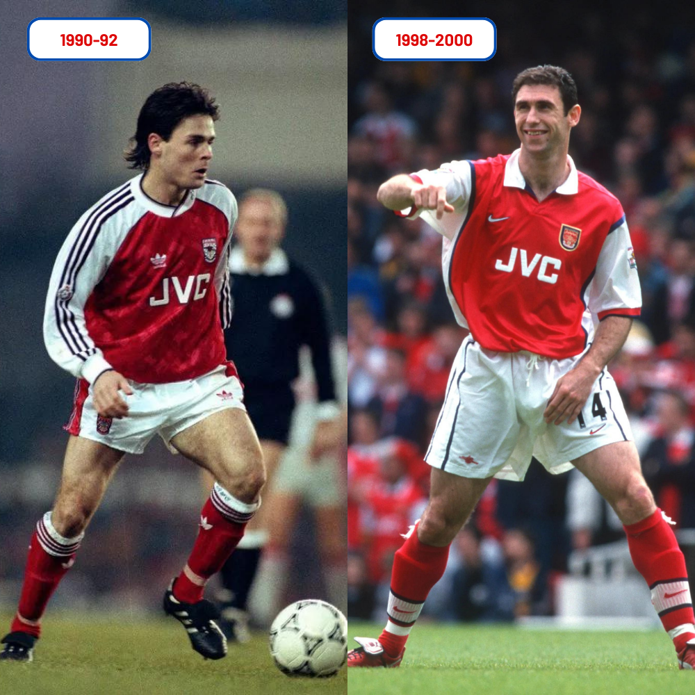
Using the adidas ‘Tiro 24’ template, the design, at first glance, appears to be a mash-up of kits used between 1990-92 and 1998-2000 with navy blue used as an accent colour and white panelling running the length of the side of the shirt.
The most interesting aspect of the design is the use of the simplified cannon rather than the full shield-style crest. While the ‘2002’ cannon has been used on recent away and third shirts, it’s the first time it’s been given prominence on a home shirt. The last time we used just a cannon was 1989/90.
The new design looks clean enough although the way the blue sweeps down the body of the shirt to correspond with the blue on the shorts means the colour is very prominent from behind.
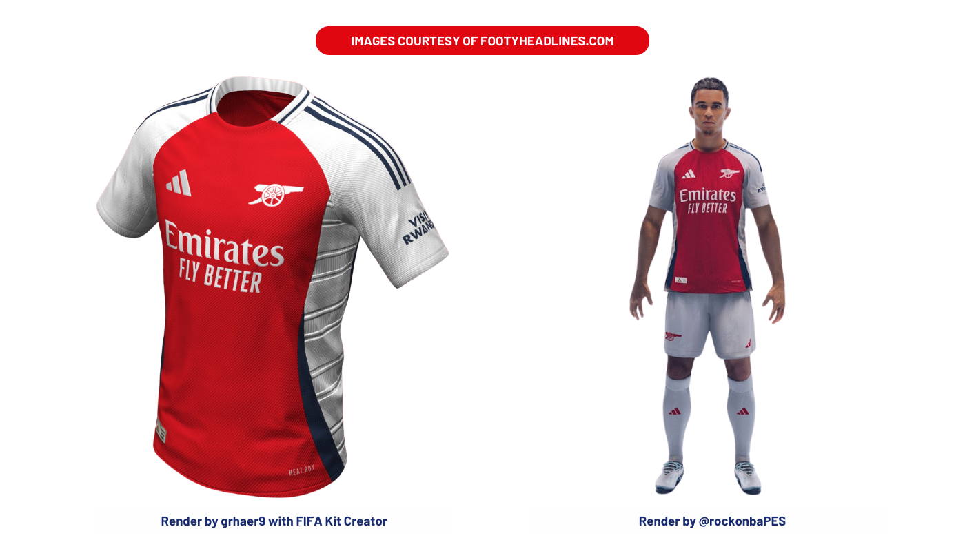
We should point out that the Gunners have integrated blue on home kits as far back as the 1880s (for shorts) and that it was also used regularly on socks through the 1930s-1950s. Umbro then introduced the colour to shirts in 1982.
Since adidas took over from Puma as the club’s kit suppliers, Arsenal have been in the habit of wearing the new design for the final game of the season. We’ve heard the Gunners will only do that this time around if a rival club has already won the title.
As for the away and third shirts, we’ve known the colour schemes since November but heard nothing more about the details.
The away will be predominantly black with red and green as accent colours, the third, featuring a retro adidas trefoil logo, will be aqua with light purple and navy blue details.


Its a nice looking kit to be fair.
Just need to add some gold stitching around the cannon barrel, to depict piano wire squeezing the barrel in the middle as a subtle nod to our annual choking.
Mark me down all you like because i’m still utterly fuming after yesterday.
29 points out of a possible 33 since January playing against a very capable Villa team. Yeah we were poor, but we look knackered IMO.
That’s what happens when you have a squad but won’t use it.
A draw and a loss would make it 28/33
29 points out of a possible 33 is ‘choking’…?!! 😂
Not saying we did choke, but choking is what you do when you’re close to the end in a winning position and throw it away because of the pressure, nothing to do with what came before.
Eric gets it.
Welcome back mate – it’s been tricky managing this lot without you here!
Don’t mind the kit, long as you keep posting pics of Limpar wearing it 😀
Is it just me or do the adidas and club logos seem a bit too big? Compare it to the 90-92 and 98-00 kits and they look massive, would be a lot cleaner/neater if they were a little smaller and more subtle imo – nice kit all the same though
You can’t beat a big cannon.
If you’re too young to remember it, look online for the yellow and blue kit we wore at Stamford Bridge playing against Orient in the 1978 FA Cup Semi Final.
Check out the size of that monster that Umbro put centrally on the chest.
Now THAT’S a cannon!! 😂
Agreed, loved the huge thing across Alan Sunderland’s chest,
Frank and Sunderland in ’79 – smaller cannon but what a bloody last 5mins in that game!
I’d still like the cannon to be turned back around the right way.
The huge logos seem to be a trend for all kit manufacturers, look at the size of the badge on the new France kit for example. I suspect they’ve found a loophole in FIFA & Uefa’s kit regulations where the maximum allowable cm² area for both logos and badges is not technically dictated by a height/width bounding box, but rather the actual surface area of the logo/crest itself?
See my comment below – sad that the Adidas logo now looks almost larger than the cannon!
Does it have Second Best written on the back
Go and listen to those twats on TalkSport. Go on, treat yourself. You know you want to….. 🙄
Well we don’t have second sewn up yet!
Or sewn on… oh ye of little faith.
It seems like they’re deliberately trying to have at least one shit aspect in every home shirt. They’ve finally picked the right crest, only to fuck up the side and make another ajax shirt.
Let’s get some perspective. Yes we managed 29 out of 33 points but when required to play two games in a week they couldn’t manage it – city managed it and that is the difference. They rise to it and Arsenal just failed to turn up – some on here saying they looked tired- that’s the most pathetic thing you can say. Arsenal bottled it and that’s it. Bottled it.
That’s absolute nonsense. The bottling it stuff is so fucking lazy. We lost a game for the first time in 3 and 1/2 months … did we play our best? No. That’s not bottling anything though.
I think it’s the nature of the performance that’s got everyone upset. If we’d gone for it and lost a ding dong match against a Villa team who just played out of their skins on the day I think we could all accept that can happen at any time to any team. But what happened was a catastrophic 2nd half performance that is difficult to understand beyond the ‘bottling’ narrative. Pressure plays a role at this end of the season and so far Arteta’s teams haven’t shown they’re able to cope with that, each season we’ve fallen away when the… Read more »
Not saying people can’t or shouldn’t be upset. I just think it’s lazy as fuck to label everything as a lack of bottle, because a team that doesn’t have bottle doesn’t go on the kind of run we were on before this game.
Fair enough, you won’t find me arguing against us being an awesome team! I just think the pattern of falling at the final hurdle is something that a lot of people are questioning. Klopp had this at the beginning of his Liverpool reign and the doubts won’t go away until you make it over the line.
Again, we didn’t fall at the final hurdle. We dropped some unnecessary points at the start of the season with draws in games we should have won, we lost form in December but we have been excellent at the final hurdle and the stretch just before. P 11 W9 D1 L1 and don’t get me started on the goal difference in that spell. The difference is lazy pundits and their cult followers will always see that spell as very poor. The worst thing in history. For perspective I’d want you to look at how city and Liverpool have perfomed in… Read more »
Utter nonsense – this false narrative of ‘patterns’ and ‘bottling’ is – as Blogs rightly states – just lazy, parroting of the gutter media (social as well) drivel.
Fact: last season does not a ‘pattern’ make
Fact: we have a better record over the past 3 months than any other PL team.
Fact: we have lost ONE in 12 this year.
The only ‘bottle’ in sight is the one you’ve had too much of, it seems!
We lost to Aston Villa, Man City beat Luton Town…bit of a disparity in league positions…..
City pumped villa 4-1 couple of weeks ago. That’s the difference I’m afraid.
And failed to score against us… on their own patch… yep, they really ‘bottled’ that opportunity.
Sod off Troll
You’ve given up. You’re the one who’s bottled it. Not me, or most of the rest of our fans, or the players. You’re the bottler.
Troodat!
Welcome to the Insta-grat club – your official Insta-brat badge is on it’s way.
Here’s ‘perspective’ – since you seem rather fond of it: 1 game lost this entire year is NOT bottling it! Perhaps you’ll get better ‘perspective’ from up the road at the Spuds Toilet Bowl… and good luck to you.
Just to be a pendant, the picture of Martin Keown is of the 1998-99 kit. In 1999-00 the sponsor changed to Dreamcast.
To be pedantic, I think you really need to learn the difference between pendant and pedant.
For me, the one Anders Limpar is wearing is much 10 x nicer than the other two
Anything Anders Limpar wears is automatically ten times nicer!
I do think that 1990-92 home kit is one of the best ever though, absolute beauty.
I wish adidas would make a “proper” arsenal home shirt and have the white sleeves end at the top of the arm instead of wrapping onto the shoulder area and ending up like wales or Wrexham etc.
Decent look although the old-school gooner in me laments that fact that the Adidas graphic is almost larger than our cannon!