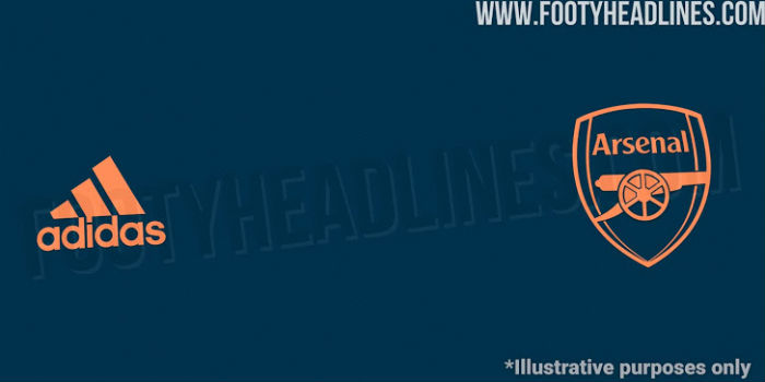
Footy Headlines have confirmed that Arsenal’s Adidas third kit for the 2020/21 season (whenever that might be) will be mainly dark navy with orange applications.
They had previously speculated that it would be navy with a fluo-yellow crest and pink / fluo-yellow Adidas brandings or fluo-yellow with blue / pink logos & applications.
The official names for the colours are ‘legend marine’ and and ‘light flash orange’ with the socks ‘collegiate navy’. Footy Headlines mocked up the below image.
 Given Mikel Arteta’s boys wear a dark navy and yellow combo at the moment it doesn’t sound too different.
The third shirt is due to be released in mid-August.
The home kit will be red and white, albeit a slightly darker red, and the away shirt is set to be ‘cloud white’.


Wow, best news I’ve heard for a long time!!!
And no downvotes below, incredible…first comments section ever?
People love their downvotes it seems. 8 hours without any, 5 hours of plenty.
Well done to all of you, you can be proud!
Cloud white?
I’m more of a tippex-white man myself
otherwise known as grey?
Full moon.
Half moon.
John Terry slips.
half moon
full moon
Steven Gerrard slips
New shirt designs would appear to be the very definition of “redundant”.
I hope this is correct and football is happening in August.
There will probably be football in August, but it will be the 19-20 season! Which is fine with me.
Sounds lovely
Siiiiiiick I love the navy ..
yeah I really love our 3rd kit this season.
Here we go. A great first season for Adidas designs and they already feel like experimenting with orange.
I am sure the designers spend as much time thinking out names for the colors as for designing the shirts..
Another license to print money at the fan’s expense! Back in Peter Storey’s day Arsenal played in red and white regardless unless it clashed with the opposition’s kit in which case he accepted yellow and blue. No poncey definitions of ox-blood and cloud it was red and white! If you, as a fan, wore last season’s replica shirt you did not look out of date. I really cannot understand why PL teams feel the need to change from their traditional strip just because they are playing away from home and in many cases their second colours are more of a… Read more »
While I agree with your post, Adidas didn’t give us 60 odd million over four years to have one shirt design. They have to make that money back in some way, and shirt sales are the meat and potatoes of that revenue. If the shirt was the same fans wouldn’t purchase yearly!
some of us old traditionalists prefer the standard, but it’s fun to have a purple and black, white or even blue and green (80’s!!) now and again on top of the red and white.
I would buy a shirt if it just had the badge and no Emirates and other adverts on it.I just don’t like walking around like a Harrod’s carrier bag.
At Chelsea, Everton, Leicester City, and many others–we should obviously wear red and white. And even the kit makers know that we must wear our home strip against Spurs, regardless of where the match takes place.
Precisely my point so why did we wear yellow when we played Everton in December and Leicester in November?
Perhaps we managed to maintain the red shirts vs Chelsea because that was still in London…
Everton wear white shorts, as do City every other season. I’d rather play in yellow than use the horrendous all-red.
I can’t upvote this enough.
Looks like Ajax away shirt
I really don’t like us wearing white (cloud or otherwise). Reminds me of a certain rabble from Middlesex.
Yeah but it also reminds me of this belter from when Hleb, Fabregas and Rosicky had us playing the best football in Europe https://www.flickr.com/photos/145988461@N07/31470108936/in/dateposted-public/
This is what happens when agents have a blank cheque and players have more than they can spend. Loved the main 2 kits this year, but now they are finding new designs simply for money.