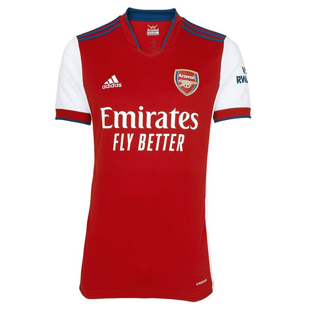
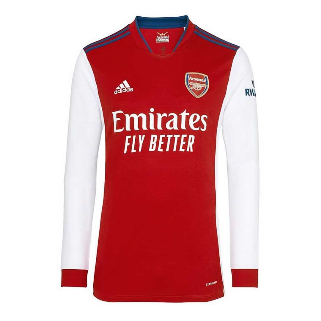
Arsenal’s new home kit for the 2021/22 season is now available to buy via the club shop and the adidas website.
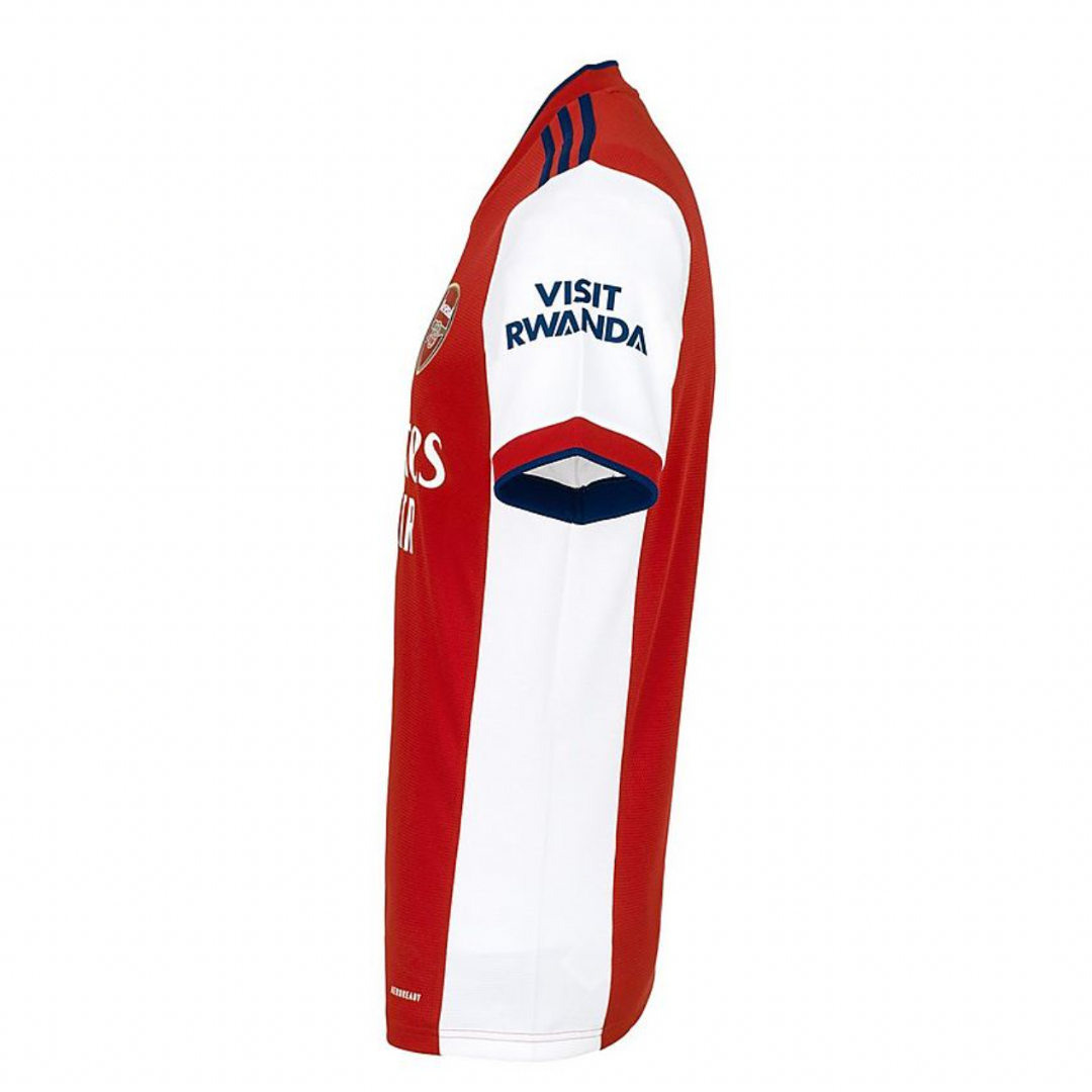
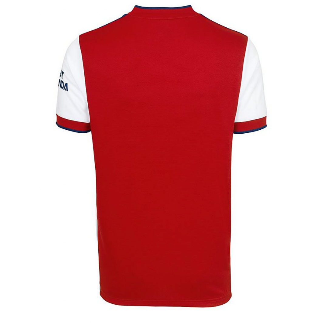
Seemingly inspired by the Nike shirt worn in the late 90s, it features more white than usual with our iconic sleeves coupled with panelling down the torso. You could argue it looks more Ajax than Arsenal. That said, it’s certainly not the worst kit we’ve had in recent years.
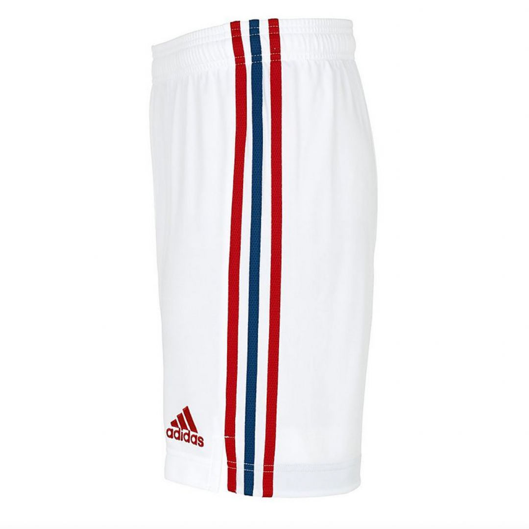
A red collar and blue adidas stripes complete the look. The white shorts feature red and blue adidas stripes and while the socks are red and white hoops.
As is customary these days, there are two versions of the adult men’s short-sleeve kit available; ‘authentic’, at a whopping £100, and ‘fan’ which retails at £65. The women’s short-sleeve kit also costs £65.
Arsenal released the all-yellow away kit back in May and are expected to release the blue lightning third kit in due course. The home shirt will get its first run out on Saturday when we play Rangers at Ibrox.
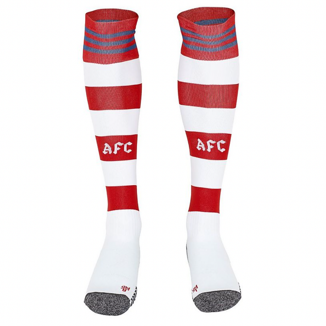


Yes the stripey socks are back
Just as I hooped
Hoops, stripes, whatever! Just glad they are back. Reminds me of bergkamp and wrighty!!
That’s the only bit of the kit I like.
Away one it is then
It’s the only bit I DONT like. Never a fan of the stripey socks but otherwise looks a sharp, crisp kit. The navy blue clashes a bit with the red on the shoulders, for me, but still gonna be glad to roar the lads on in that
It’s certainly up there with the worst kits of recent years.
Agree. It’s Where’s Wally finds Ajax
I dunno, even when the leaked versions were popping up I seemed to be the only one who really liked the kit… I’m a big fan honestly. I like the blue stripes too, it’s a little different but it’s minimal and not excessive. Something new! Plus I always like it when the kit is loose, my least favourite kit was that horrendous skin suit puma one.
With the leaks, i wasn’t quite sure. But it is actually ok. Nothing will beat 16/17 home as the worst shirt.
Idk, for me 18/19 is up there for the title
You’re not on your own Jules! Not my favourite ever, but I certainly don’t dislike it.
Another kit which will be associated with our mediocre years.
Visit Rwanda? Seriously?
This sleeve sponsor bullshit is the absolute pits.
It’s that crap that’s preventing the three stripes down the sleeves – as iconic an Adidas look as the Trefoil logo, which has also been dispensed with and needs bringing back.
The easy solution would be to have the stripes go all the way down the sleeve and then have a break where that stupid sponsorship logo goes. Not the most elegant, but it looks better than the stripes stopping at the seam.
I seem to remember the old Barclays League logo being put over the top of our shirt sleeves during the 1990/91 and 1991/92 seasons. That looked ok.
Many clubs who were using Adidas did the same thing with the Premiership logos once they took over and the Champions League logo.
Why we can’t do the same now is beyond me. But then why Arsenal do a lot of what they do is beyond me now….
Not the best time to be promoting travel abroad… but that’s the deal we’ve had for a few years now.
Are you denying the chance for Rwanda to grow their tourism economy by advertising?
Rwanda is such a beautiful country.truly stunning, it’s known as the land of a thousand hills.
Rwanda has a troubling human rights record, not really a regime the club should be associating with IMO. But then again, our stadium is literally called “The Emirates” while 4k workers have died building stadiums in Qatar… Football has become a convenient place for these regimes to launder their reputations. Unfortunately our club like many others is too happy to take their money.
Qatar isn’t part of the Emirates…
You are right, however construction work in Dubai (definitely part of the UAE), is a similar nightmare.
Illiterate Indian workers sign contracts for jobs building tower blocks in a desert, working in conditions that kill many and under terms which drive others to suicide. No chance of escape as under the contract they owe their employer money for the opportunity and their passports have been confiscated.
True – my mistake. However it’s my impression that a lot of the labor practices and treatment of guest workers is similar as onenil pointed out.
The day we start getting money from the head choppers of Saudi Arabia, l will be done with Arsenal.
I like it
Hi dude, aren’t you from Czech republic? Cuz i am, and your surname really make me laugh 😉
Well I don’t. It’s very meh. And I don’t want any blue on my Arsenal home kit.
There’s a lot less white down the sides than it appeared in the previous leaks.
I think the whole “it looks more like Ajax” is a bit lazy and based on what was shown previously, at this point. I mean, you can’t even see the white down the side in the front-on view.
I like it….looks like the ’08/09 season home kit…fond memories of Fabregas, Rosicky, Sagna etc
Was everybody back then ripping it up for beeing an Ajax shirt? The design is not completly new.
No, they were ripping it up for looking like a Charlton kit. It didn’t even have white sleeves. It was horrible.
The socks are cool. But the shirt is… I couldn’t be bothered.
F**k off with the blue. Blue shouldn’t be anywhere near the home kit.
That said, I’m on board as all I see is a Little Mozart when I see it.
Agree where has the blue come from makes us look like Palace this kit is wank…apart from the socks…they’re great
#NoBluePlease
No thanks. Won’t be handing the evil Kroenke any more of my money. I hope enough of us will stop buying official arsenal stuff for KSE to notice the dent in revenue.
Not a fan of this shirt. The blue stripes on the shoulders make it look a confused mess. If not white they should have made them golden yellow. Lacks a strong identity. A shirt that reflects the state of the club at the moment. Hopefully our football this season is greatly superior to this shirt.
The shorts and socks look alright though.
Having been clamouring for Adidas I’ve only liked a couple of the shirts so far. Serves as a reminder that most modern football shirts look shit. I’ll stick to retro.
£65 for a football shirt is madness. I know we are far from the only ones charging that, but it’s so steep
It’s such a con but at least an adult shirt can last years on the 5 a side pitch and (if lucky) become a cool retro option.
The kids versions make me weep. £45 for something they will grow out of in a year is appalling.
By kids, for kids. I have a friend who’s son changed allegiance twice in the last couple of years. Full kit of course. I’d say save up your pocket money.
Solid 7 for me. Unfortunately, apart from match days, I no longer give the club any of my money. I tend to be my money back in free booze 😉
Ironically, my last bit of merchandise was a subtle canon wallet.
Like some have said, the kit brings back gooood memories. Leaves me feeling like everyone needs to come back home.
The shorts are fantastic, the socks are nice, and the shirt is OK but a little boring. Would also prefer a darker blue.
It somehow looks better now than it did in the leaked photo I saw earlier in the year. Which makes no sense as I went back and checked and they’re identical.
Would still prefer it without the side panels
Is it me, or is there way too much text on a shirt now. I wish they didn’t advertise on the sleeves.
That collar is going to be quite dramatic when players get pulled in the box!
Altogether now…
“3 Lines on the shirt”…
I get why people don’t like it, the ajax vibes and the blue isn’t for everyone, but as someone who always likes it when clubs do something a little different with their kits (come on, change can be fun!) I think this a good example of them getting it right. I like it, it’s loose, simple and classy. The blue isn’t excessive, the collar is strange yeah but not horribly weird or that posh polo shirt situation. I’ll say, I really like this kit.
And the white on the side isn’t as invasive as some leaks made them out to be. When worn they remind me of peak Ramsey era
All I see is the blue. It’s like someone said a true reflection of the mood around the club.
Last two seasons: good kits, bad seasons. So we should win the league in this pseudo-ajax monstrosity.
Would have preferred the previous design of 20/21! But this is fine too!
Hey Blogs! Any chance you could put up a transcript of your podcasts? Be great to read them instead of listening to them…
Might need to redo the bits about Willian given it seems he had a weight vest on
He plays like he’s massively overweight. He might no be overweight and unfit in reality but he is in spirit.
It looks weird at the neck area.
“Authentic” at £100. A hundred quid for a bit of nylon. Probably costs comfortably under a fiver to manufacture.
The website says the material is recycled polyester, so probably even less than a fiver due to a shorter chemical process. Haven’t been a fan of polymer-based fabrics since I noticed they make me sweat more.
I wonder which club will be the first to bring back wool jerseys again. Now that would be a more justifiable purchase.
Not the best, expected worse. Finally launched at least, now announce Lokonga in the new home kit and get more necessary transfers (in and out) done asap (not the arsenal way pleeeeeaaaaaase). Or do we wait with a new transfer until we have launched a new kit? Hopefully we’ll have 4/5 more kits this season then.
Long sleeves all the way baby.
I like the design, but can’t stand the blue. Either way Kroenke won’t be getting my money.
Yeah and signing the likes of Tammy Abraham will shift loads of those shirts, right? Ahaha. I’ve missed how sad our transfer rumours and/or acquisitions are. Sigh.
Tammy Abraham would feel a bit… Welbeck-y. A good but underwhelming player.
He wouldn’t get into the starting eleven though and I think it’s just agent talk given Giroud is moving to Milan but, let’s see.
I miss the bustle of Welbeck. The amount of good/promising players that aren’t with us due to injuries…
I don’t mind the idea, but that collar is atrocious. Throw a white crew neck collar on and put some blue piping down the sides to break up the Ajax panel look, and it’d be gorgeous and harken back to better days.
That said, we’ve already had two gorgeous home tops with which we’ve won fuck-all, so…
*in the league
Hard pass on the kit don’t think the blue belongs, socks are the only decent part and no $ for KSE to boot!
It’s solid. Not the best but beats everything Pima ever did.
Yeah….no
Not proud of this club anymore. I think I’m fine with my earlier jersies
Dear Home Kit,
No one loves you
We don’t need to say anything more, you’re just a shirt.
Again, no one loves you although some may be unoffended by you.
You’ll overcome this, we’ll overcome hating you.
We don’t love you.
£100, I hope that includes the socks…?
Having some blue in it at first seemed a little strange. But I remember when the socks were blue-and-white hoops to go with the traditional red-and-white shirts. Meanwhile I’ll keep on wearing my 1950 replica shirt, very well made but sadly no longer on sale.
Not really a fan of the blue stripes. they don’t look bad on the shorts, but they are very jarring on the shoulders. And I don’t associate blue with the Arsenal home kit at all. I suppose you can only do so much with red and white though.
I see the club has gone for red with white sleeves. A bold choice.
Looks like an Arsenal shirt.
All supposedly goes back to when Herbert Chapman saw someone wearing a red sleeveless sweater over a white shirt. A stroke of genius by Arsenal’s greatest manager!