

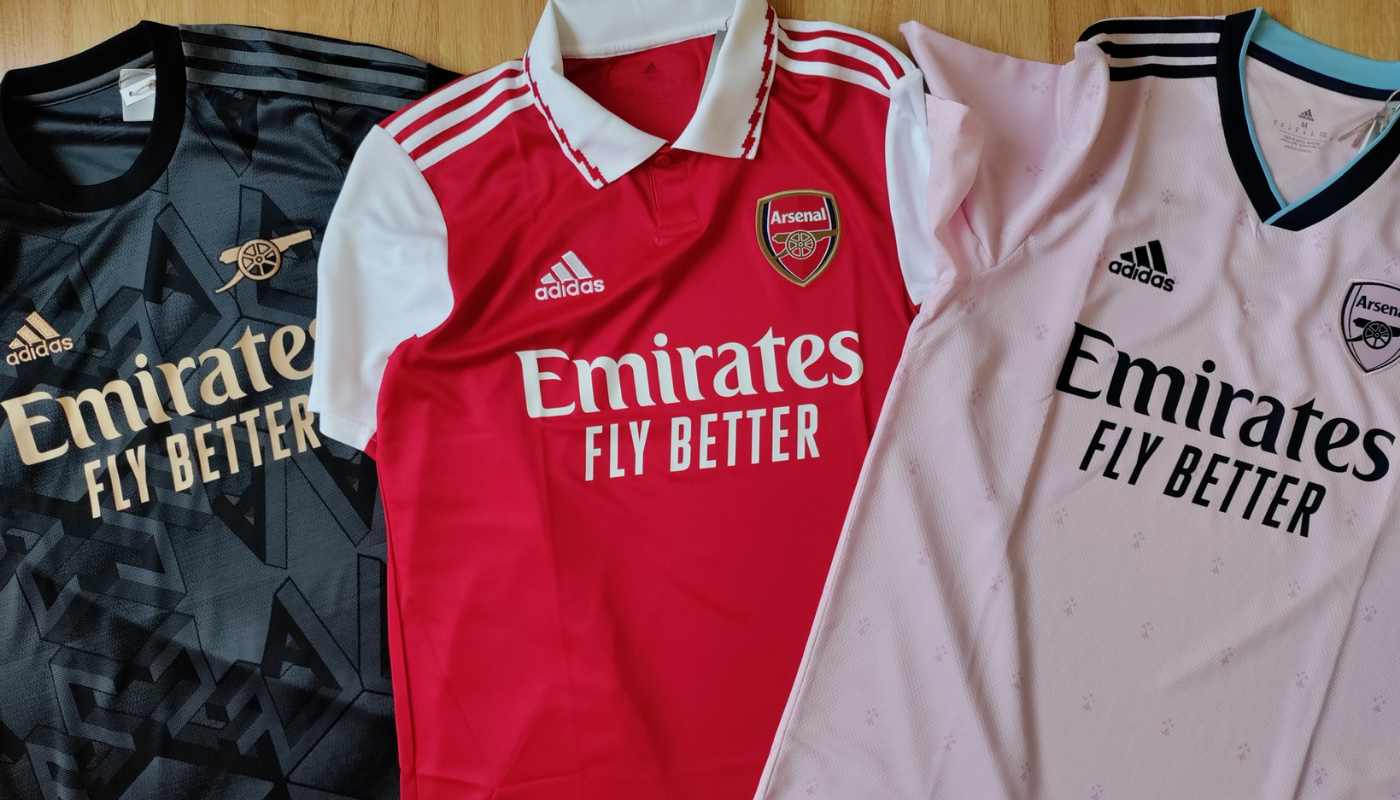
Last week, we got a first glimpse of next season’s home kit.
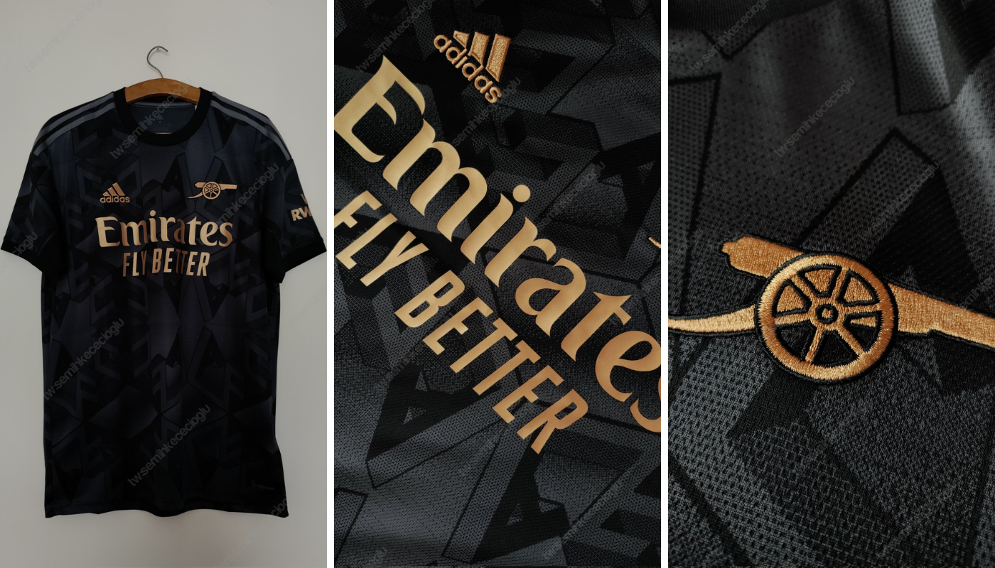
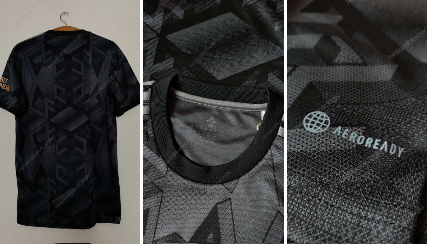
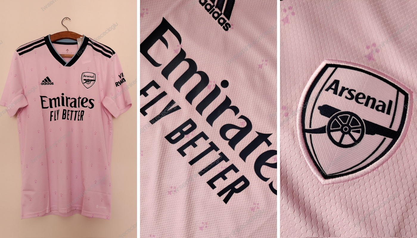
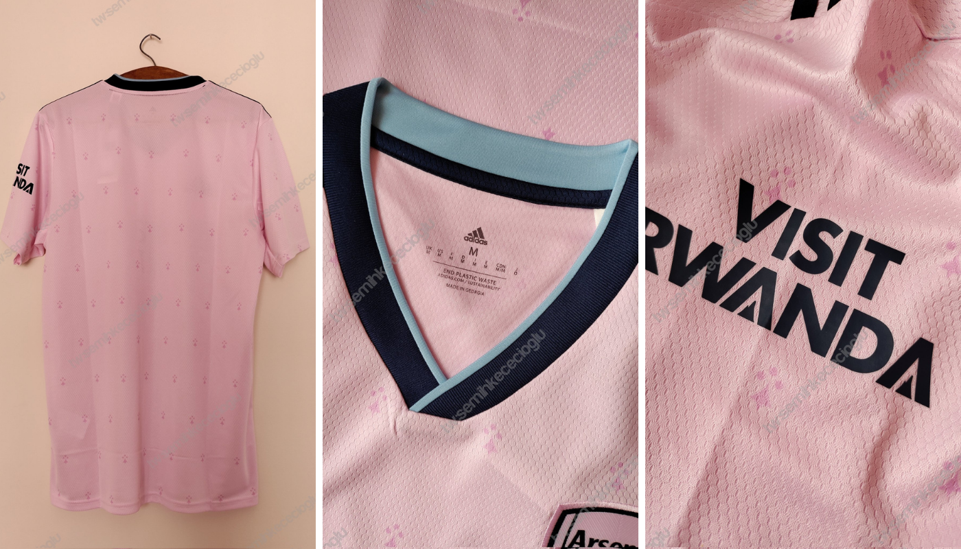
Today, courtesy of Twitter user @semihkececioglu, leaks of both the black away and pink third kits for 2022/23 have surfaced.
While the choice of colours won’t be to everyone’s liking (grrr…the away kit should be yellow and blue, blah, blah, blah), we think they look pretty smart.
The black away kit features grey adidas stripes while the Emirates and adidas branding and the ‘retro’ canon badge are all in gold. The AFC pattern in the background appears to take its inspiration from the ARSENAL lettering that greets supporters at the entrance to the Danny Fiszman bridge outside the Emirates.
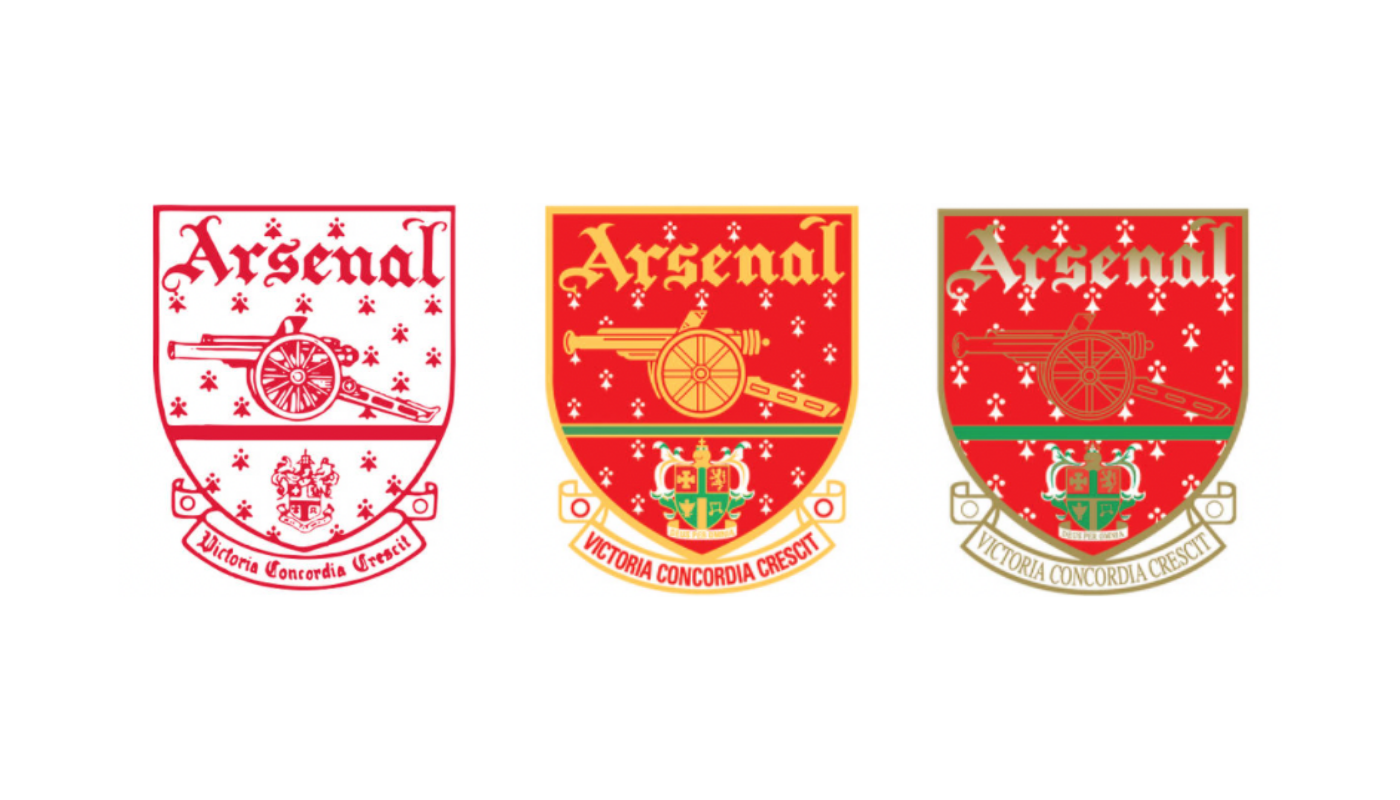
The pink third kit features navy and light blue accent colours and features a subtle motif that nods to the first Victoria Concordia Crescit crest that was first used from 1949. The crest and sponsor branding appear to be black.
What do you think of the new shirts?


All 3 are bloody awful. Shame, pretty much everything has been on point so far with adidas
I think they’re all lovely!
Yeh me too. Love them all
I agree. The kit concepts have from Adidas have been pretty good so far. The only thing I don’t like is the collar on the home kit. It reminds me of my primary school uniform.
This years home kit wasn’t nice for me, but its all subjective I know plenty of people that loved this years kit, home and third are lovely, away isn’t my cup of tea but that’s just me!
Just the cannon on the black is beaaaautiful. I’d wear this for my 5aSide any day
Black is super cool, but a little on the busy side? Maybe it will be better for reals. I also spent a while starting at it before the AFC clicked. Just me?
The black shirt is outstanding. The opposition will be left chasing shadows.
Away kit should always be yellow and blue.
Save the experiments for the third kit.
This away kit would be a great 3rd kit.
We went 82 years before we had a yellow away kit.. the yellow stayed until 1994 (with one season out for that green and purple thing), and since 94 the yellow away kit has been on and off. I think most people like having a yellow away kit but I don’t think it should always have to be yellow..
Bottom line is that we only win the league when the away kit is yellow (going back to 70’s), so on those grounds alone, it should always be yellow
Well technically we won the league in a gold away kit in 2001/02.. but yeah I’ll go with that! Also I think I’m right in saying we never lost a match in that gold Sega one.. (I think).
Except for the times we wore yellow and didn’t win the league 🤷🏻♂️
I didn’t say we always win the league when the away kit is yellow, just that we only win it when the kit is yellow.
We won the title up at Old Trafford wearing Gold and Navy.
I’m counting the gold kit as yellow with a twist!
1982/83 away kit was not green and purple.
It was bottle green and navy.
Most people hated it, but I loved it. The only trouble was that we had numpties like Lee Chapman and Chris Whyte running around in it. And George Wood in goal.
Also loved the green and blue. A true one off classic like the bruised banana
Yes you are right.. I was a little kid at the time and in my mangled memory I see it as purple but looking it up it was clearly blue. Interesting that both Chapman and Whyte were stalwarts of dirty Leeds’ title winning side of ‘92.. and Lukic of course!
Well said. 👍🍺
One way to get in with the ‘ref’ crowd, I suppose.
If we dress like referees will we stop getting sent off?
With any luck the refs will start sending themselves off.
The dopey useless anti-Arsenal cunts.
It seems they’re in a cycle on 1 yellow year, 1 non yellow. So 23/24 we’ll be back with the correct colors.
I don’t mind these too much as shirts but they look weird as Arsenal shirts.
Something about the 3rd kit to call it Arsenal, they’re both nice but it’s like they designed the kits first then decided to slap the Arsenal crest on as an afterthought.
The number of times I’ve been slapped as an afterthought. Honestly.
even though one of the main design elements of the shirt contains an emblem we used in our classic logo?
The away kit should be the 3d kit, and the pink one should have never left the first meeting.
It’s clearly for the girls, and that’s fine. But please don’t expect the men to buy it, and don’t make the mens team actually play in it.
Because men can’t wear pink?
I’m as old school as the next Boomer, but I guess you’ve got to move with the times mate. Indeed, I found myself checking myself – and recollecting that back in the early 80’s I wasn’t above wearing a white and pink Fred Perry or various 80’s casuals designer (Sergio Tacchini and Lyle & Scott) pullovers and cardigans that came in pastel shades – lemon, sky blue and yes, pink. Between 1982 and 1986, the North Bank was full of Casuals wearing a lot of the above designer gear – and some serious gold bling as well – although I… Read more »
oh my god. ive been waiting for black kit for so long. im dripping.
Pink should never be used as an option! Can’t stand pink (can you guess 🤣🤣)
Do like the black kit and cannon as the badge though.
Lets hope that pink kit looks awesome under the glow of European floodlights in the Champions League!
Neither black nor pink are football shirt colours!
I’d agree, but then both of us would be wrong.
Black kit I f—-ing epic been waiting for this all my life
Black is beautifull. Pink is decent, but it reminds me something, can’t grasp it. Anyways, good kits, can’t wait for them to be showcased in europe 😉 COYG!!
Isn’t it Real’s 20-21 kit?
Majin Buu?
Curtains… in an old folk’s home
That’s exactly right.
“Nan called, she’d like her dust ruffle back”
This second and third jersey more beautiful than the first jersey. I love the black though
I first thought this was mistakenly published two days early!
They are all cute.
You sound just like my two teenage daughters.
They can’t wait, apparently, to see Saka, Martinelli, Odegaard and ESR in the pink kit.
Their dad, meanwhile, just rolled his eyes and shook his head…..
Bloody hell. Two teenage daughters. What is the inquisition like when one of them brings a boy home to meet you and the missus?
Yes No No
Presumably the black kit is to highlight BlackLivesMatter and the pink kit is to highlight LGBQT.
The black kit will look sharp under the lights in the Allianz Arena in our last 16 Champions League tie next season.
The more I look at the pink kit the more it grows on me but I think the texture of it makes it look like fish scales. Which I guess goes with the salmon pink. My daughter likes it as it looks like it has cat paws on it *sigh*
I’ll be buying the black kit but I do wish the background pattern was toned down a bit.
Black one is cool. The other two are pish.
Go home, Adidas. You’re drunk.
The black is too busy. The pink is too.. pink, and the blue cat-paw motifs don’t look good.
(I know I am probably the only one, but I enjoyed the Puma designs more)
I’m not a great fan of the pink kit, but the ‘blue cat claw motifs’ are from our 1949-2002 badge. I wasn’t going to buy the pink kit, but because of the old badge pattern I just might.
I think the GK kit will be yellow though.
It’s possible that Ramsdale will actually just play shirtless and paint himself with dirt and mud while swinging from the upright next season to intimidate the opposition like in a predator movie! I’ve heard…
The black kit is a thing of beauty, I only wish the Adidas stripes were gold too. It’s a Premier League winners away kit.
Yes. I wish the Adidas stripes were gold on the black kit too. That would have looked slick.
I’m loving the simplified crest on these away shirts. Gold on black is beautifully crisp and sharp, looks great. I wonder if they’re checking public opinion for simplifying the badge full time?
They won’t totally simplify the crest. Its hard to enforce a copyright on just a canon
Liverpool and Spurs have simplified their crests, can’t see why we couldn’t. Maybe stick the name or an AFC with it to make it more unique but it’s so much cleaner than the current badge
Back in the late 70’s and the 80’s the canon had three canon balls underneath the barrel with A, F and C in each one respectively.
That was a marketing ploy I’m sure – and it would probably work again – plus adding another touch of retro in the process.
They should bring back the three A F C canon balls under the barrel of the canon.
That might make the copyright easier.
That pink kit is a bit…. fleshy for me. Looks like pigskin.
Black is on point though
well at least none of them are white and blue this year
Can’t wait to see some 25 stone pie muncher crammed into that pink shirt like an undercooked sausage with a crest.
Thanks for that. Just spit out my lunch
😂
Black kit looks badass. Sometimes you have to break old traditions to create new legends.
Black should be third, but that aside, love it. Crew neck too. Nice. I’d like the home if it wasn’t for the Shazam bolts on the collar.
Remember not to put the black shirt in the same wash as the pink shirt…
Well, the missus and my daughters love the pink.
Me and my lad love the black. The team are going to look great in that.
Mixed opinions flying around about the home shirt, but generally speaking happy days chez Qwaliteee.
Wow… What an absolute abomination Adidas have served up for next season. Why not just stick with this year’s infinitely better shirts??
I agree that we should have stuck with the away kit. The pale yellow is as easy on the eyes as our recent form.
The away kit should remain yellow and blue regardless.
Adidas can then tart around with the third kit to their heart’s content.
Any marketing team worth it’s salt listens to it’s customers. Arsenal fans have campaigned for literally decades for our away kit to remain yellow and blue – but it falls on relentlessly deaf ears.
Ridiculous when you consider the club are actually aiming to turn a healthy profit.
They’re all fine for me, but adodas have used the same collar as the pink for all three.
*Adidas should have
I like the home kit, and I think the black away kit will grow on me. But the pink is just awful.
Black shirt bought! Or it will be as soon as it’s available!
I don’t like the collar on the home shirt, never have liked the collared versions over the years.
The black one looks nice but there is nothing ‘Arsenal’ about it except the crest.
The logo is the boldest part and as it’s Emirates you could be mistaken as any number of clubs also sponsored by them.
A shirt needs to shout ARSENAL.
These are the worst from Adidas so far, which is a shame
I like the black kit. 7/10 ( it’s like watching the games in the 1939 movie “The Arsenal Stadium Mystery” )
Pink is effeminate and looks like my undies after being washed with a lost red sock. 2/10
Classic red/white…hides the blood nicely. 9/10.
Have a soft spot for the Cranberry of a few years back. 8/10.
Greetings from a Brit in Tasmania….
cheers
Nick C
Back in black!
Okay, That black kit might be the sexiest thing iv ever seen
Love it when we’re so into the kits when they’re released or leaked but when a new season starts we get back to the football. Results, player, performances, etc, you know the real stuff
I like the black and gold but the pink kit is a bit wishy-washy. It looks like what happens when you leave a red sock in a wash for your white teeshirts and undies. The proper red and white shirt is fine. At least it has an actual all-red body, unlike this year’s terrible effort and the collar reminds me of the Bergkamp/JVC years.
Not a fan of the black kit. What are we supposed to be PSG or Real Madrid now? Not a fan of the pink kit either. Wish they’d stick to using the crest colors that actually represent the club.
Adore that pink shirt, but I definitely don’t understand the blue accents – pink and black alone would have been perfect.
Lovely kit, I love the short more than the top. Anyway, awesome design. Wish I could lay my hand on one.